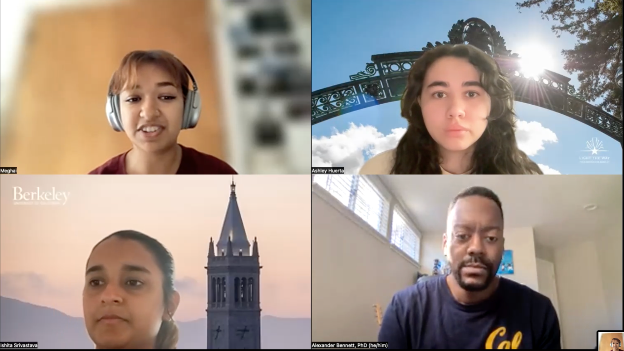
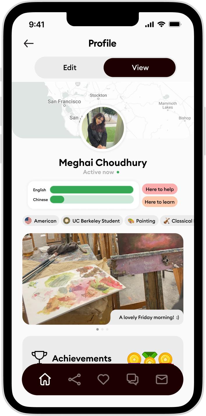
Meghai Choudhury
meghai@berkeley.edu
LinkedIn
meghai@berkeley.edu
CS & Design, UC Berkeley
Jazz Violin · Visual Arts
UI/UX · User Research
Jazz Violin · Visual Arts
UI/UX · User Research
UI/UX · User Research
 Tap to open
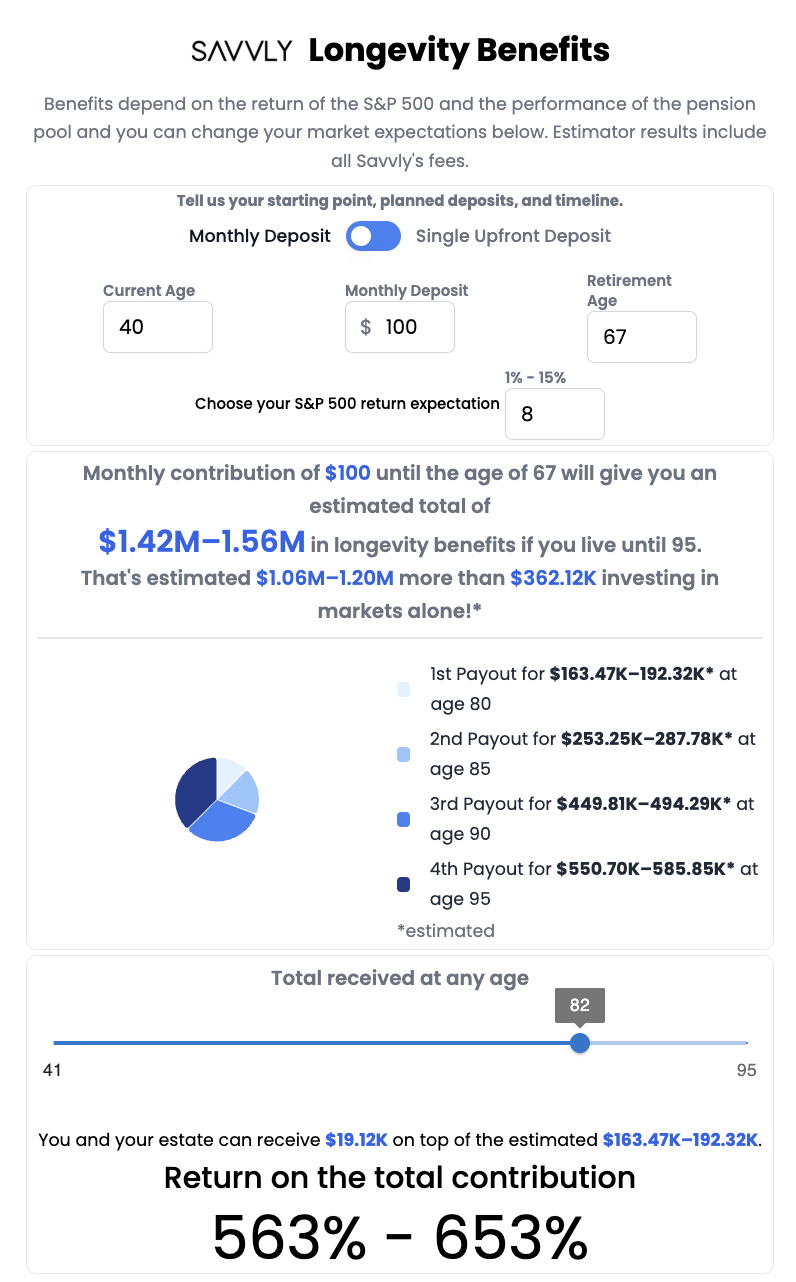
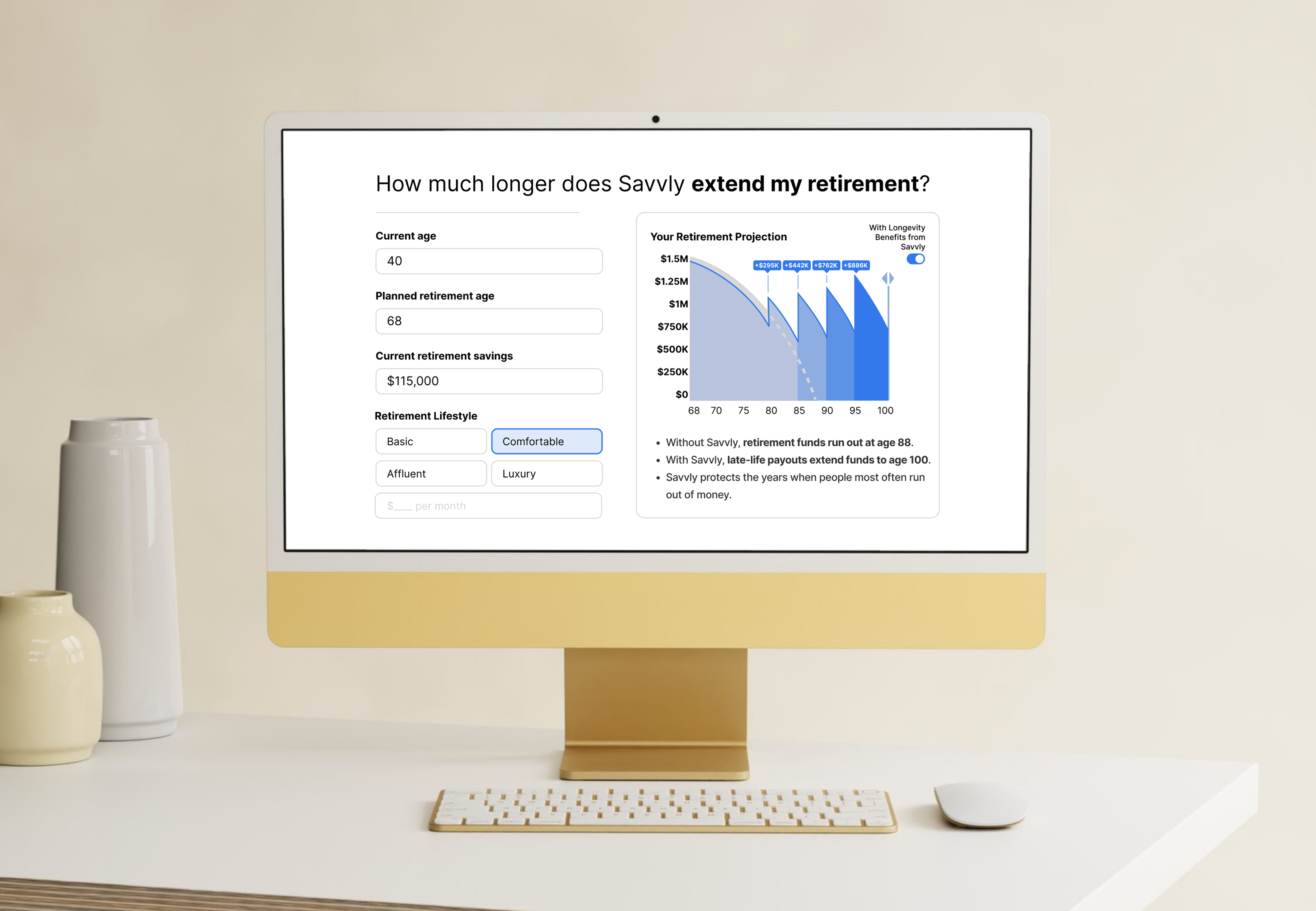
A longevity benefit that pays out structured cash at ages 80–95. As the sole designer, part of my work included redesigning the client dashboard and landing page, where I worked on translating a complex financial product into a narrative people could resonate with.
 Tap to open
A practice tool for jazz musicians learning solos by ear, built after watching real musicians transcribe.
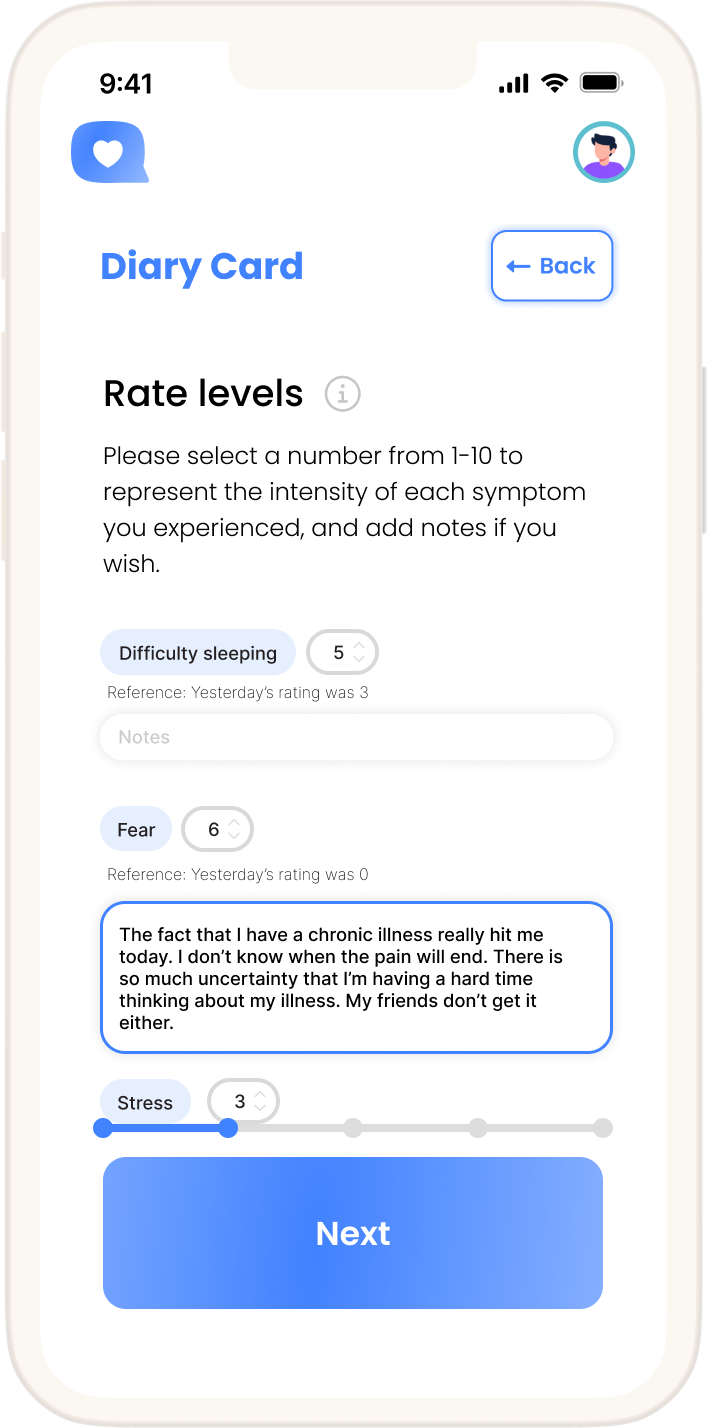
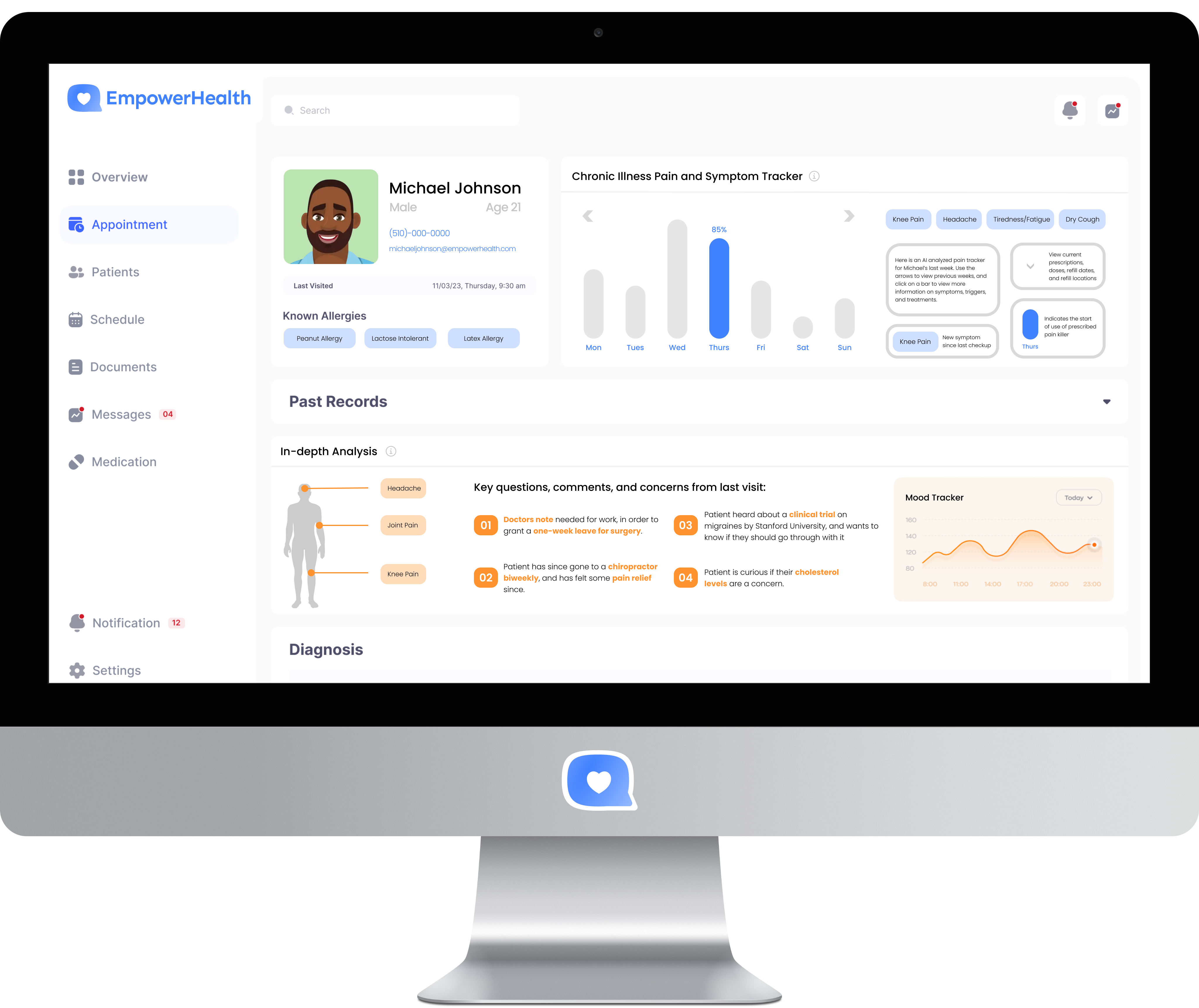
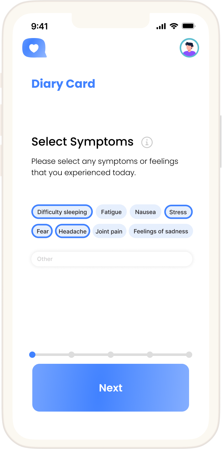
An alternative patient portal for youth with chronic illnesses — designed to increase visibility and emotional connection within a healthcare system that often makes young patients feel invisible.
 Tap to open
A platform for college consultants to manage students through admissions. I noticed a gap in how students prepared for writing sessions and independently designed a five-phase brainstorm portal to address it.
Joined seed-stage startups as first UI designer — logo, identity, marketing, and web from scratch. Several went on to YC or Sequoia-backed rounds.
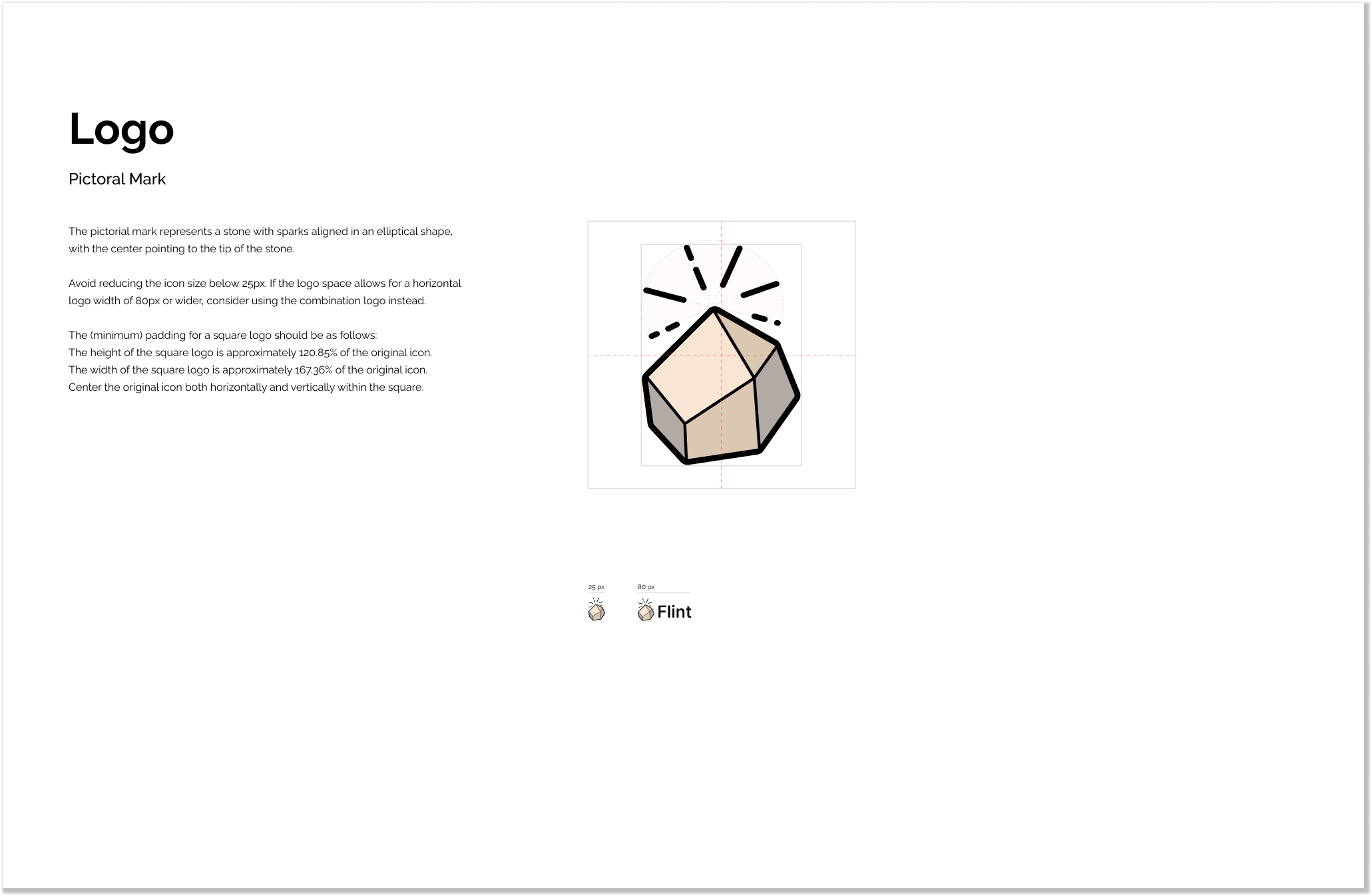
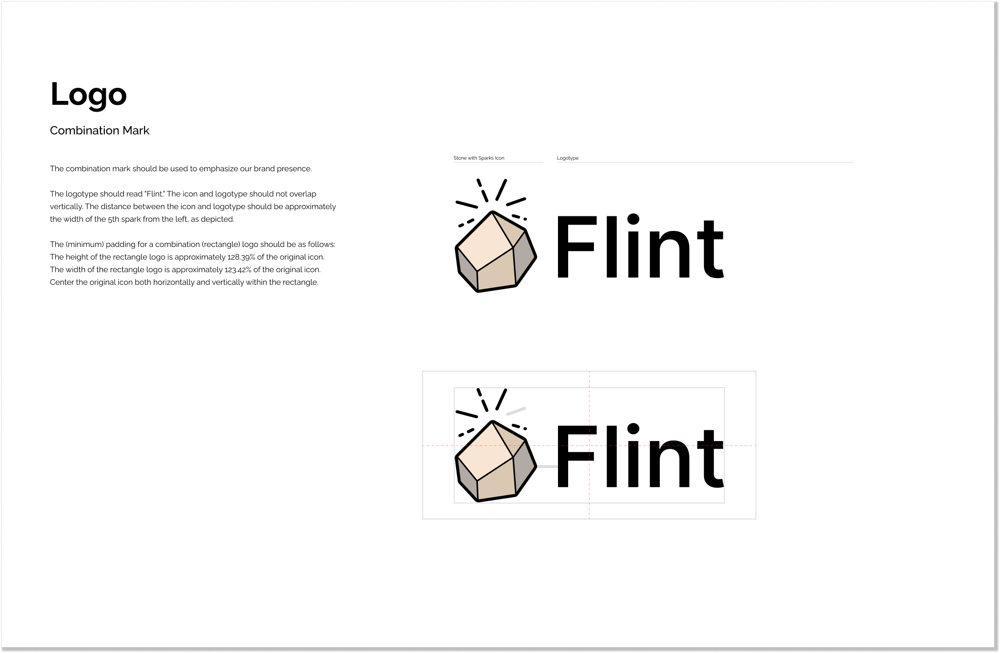
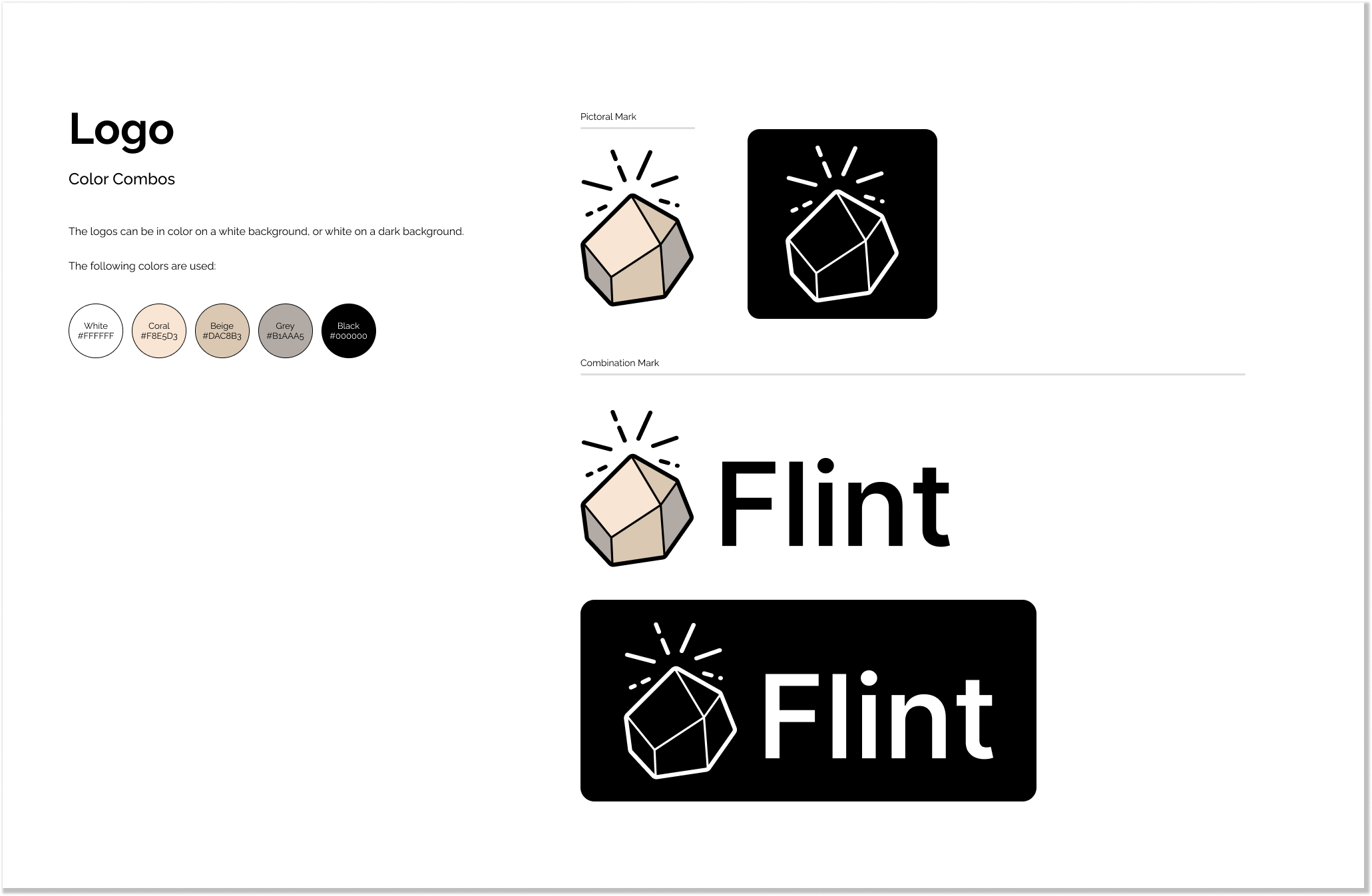
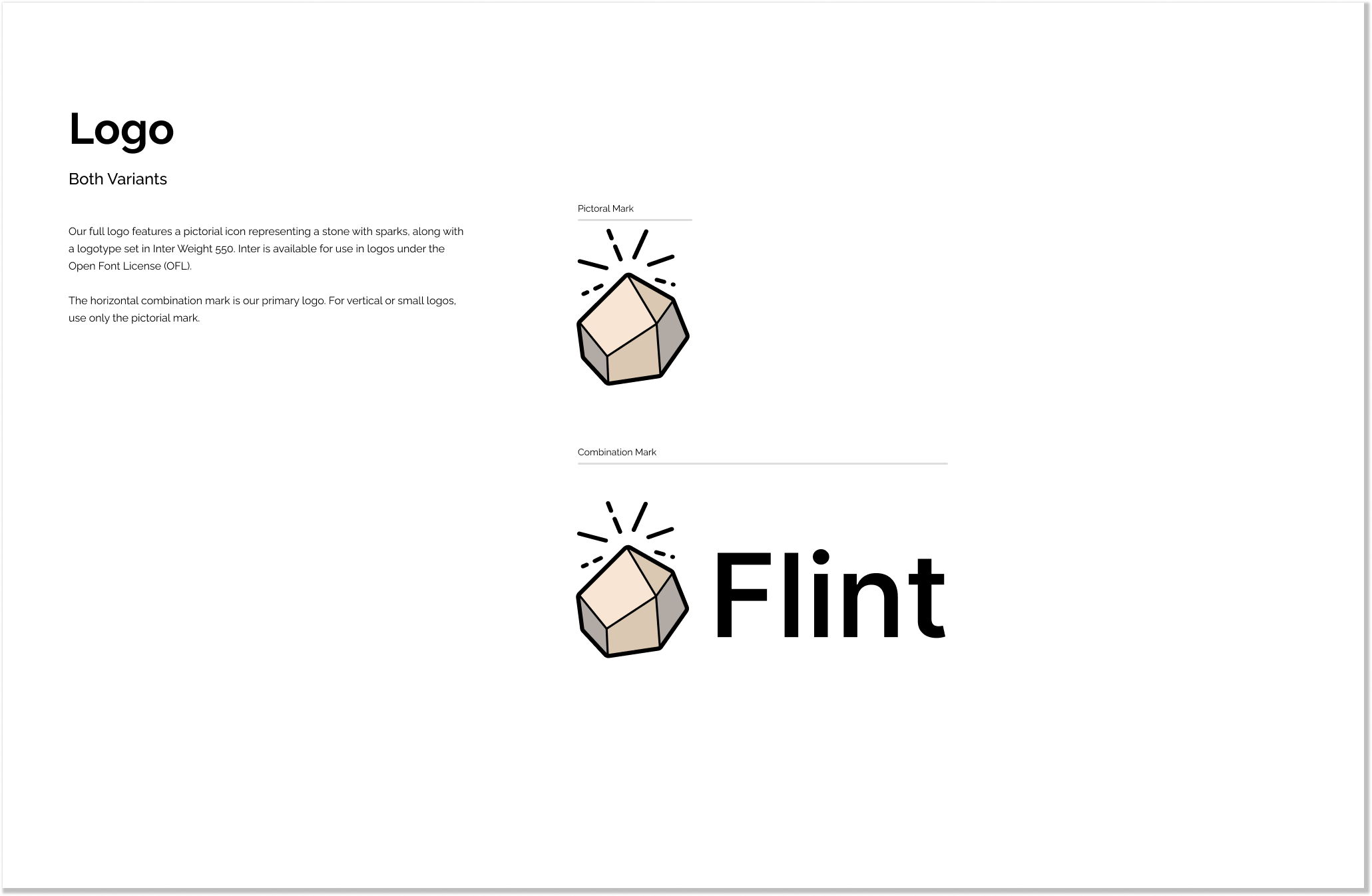
Flint is an AI tutoring platform for K–12 students. I joined as the first designer to build the brand from scratch. The logo needed to feel approachable for students and teachers and embody their mission to ignite progress in the education sector.
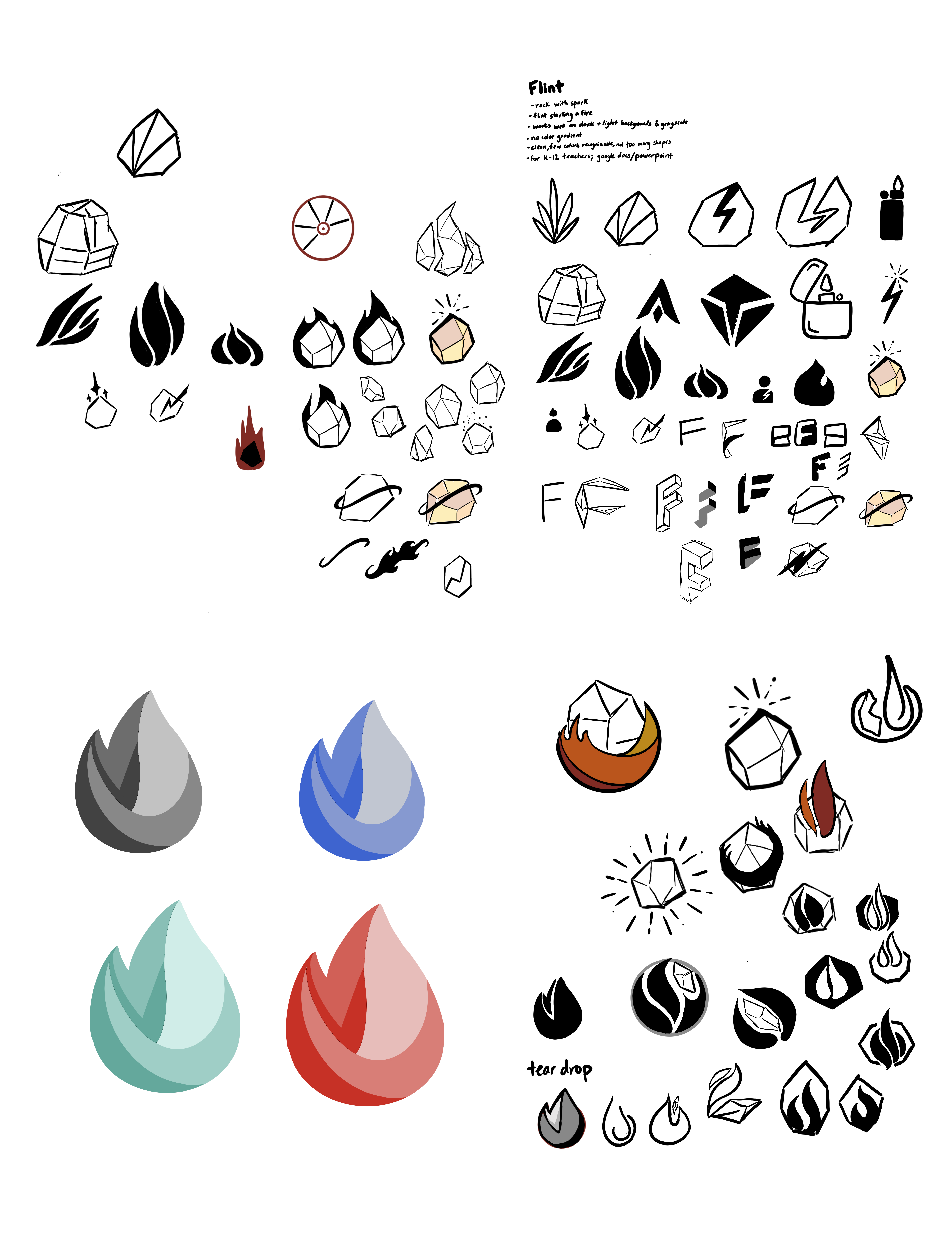
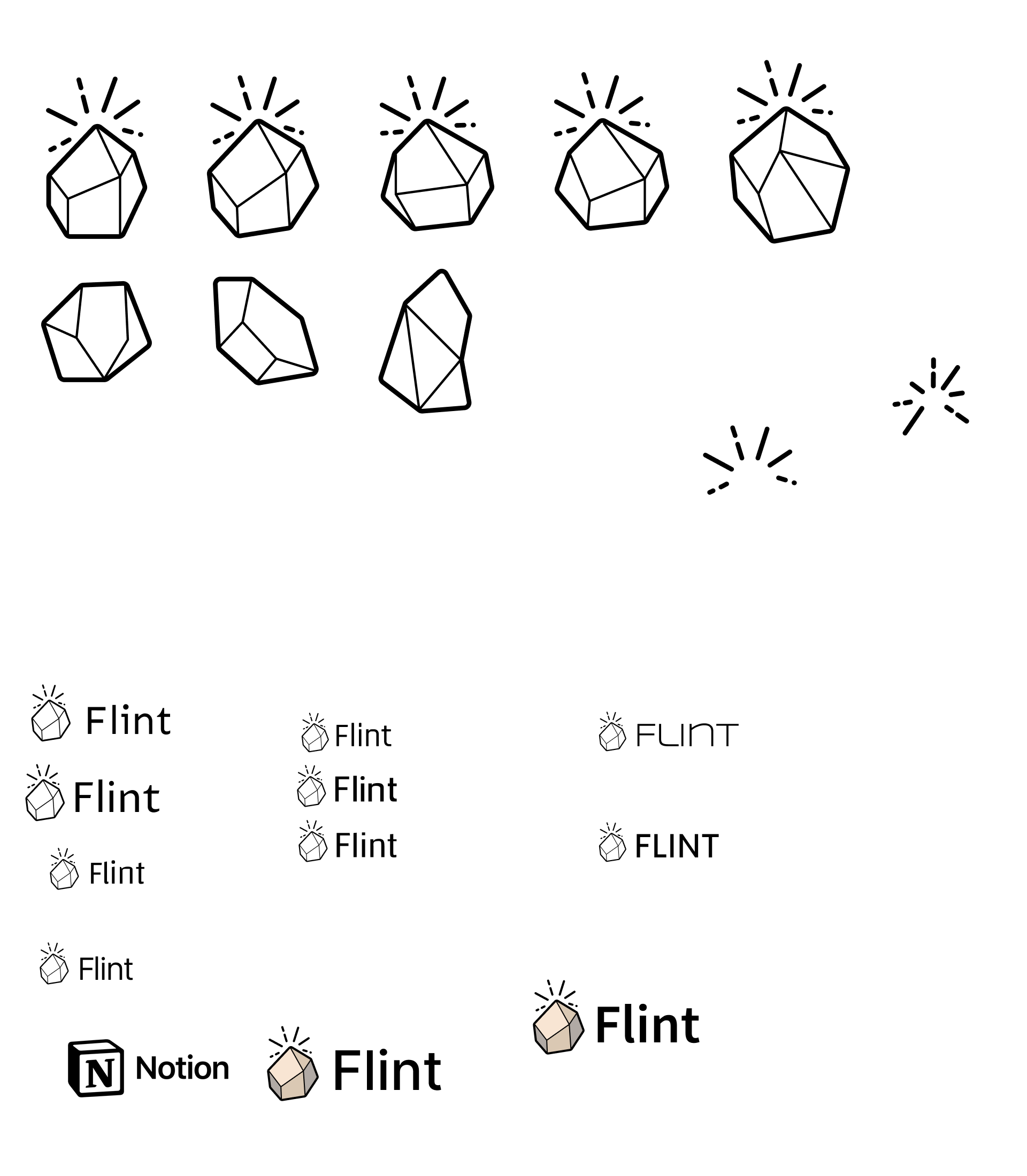
I explored a wide range of directions before landing on the flint stone with radiating sparks, taking its name as inspiration.

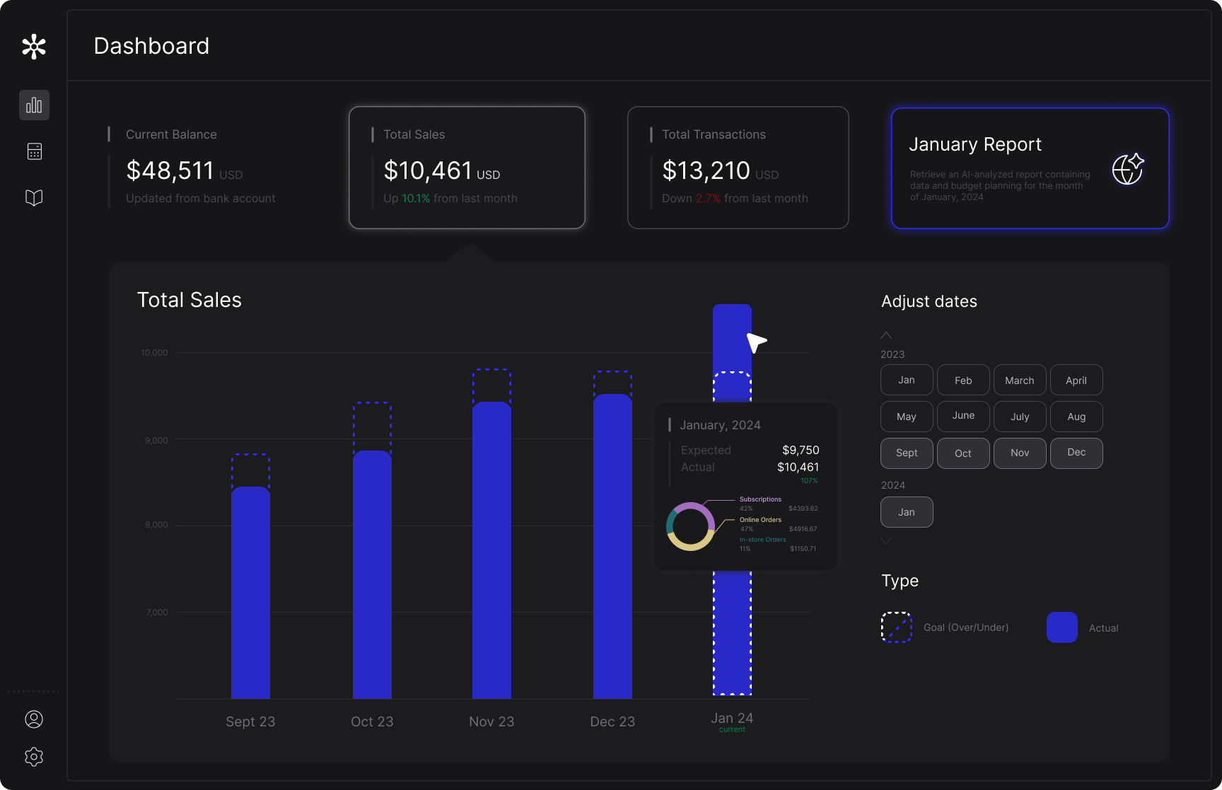
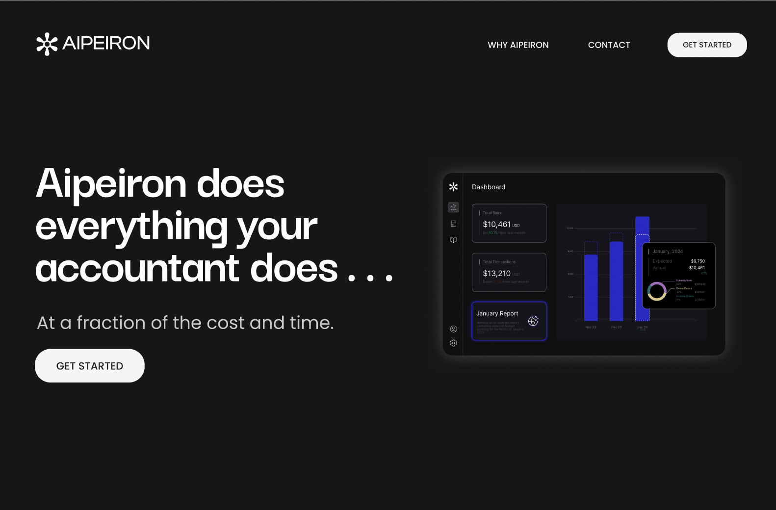
Aipeiron is an AI accounting platform for small businesses. I designed the accounting dashboard, and created a mockup for the landing page, using prior user research to inform the data visualization and layout decisions in the dashboard.
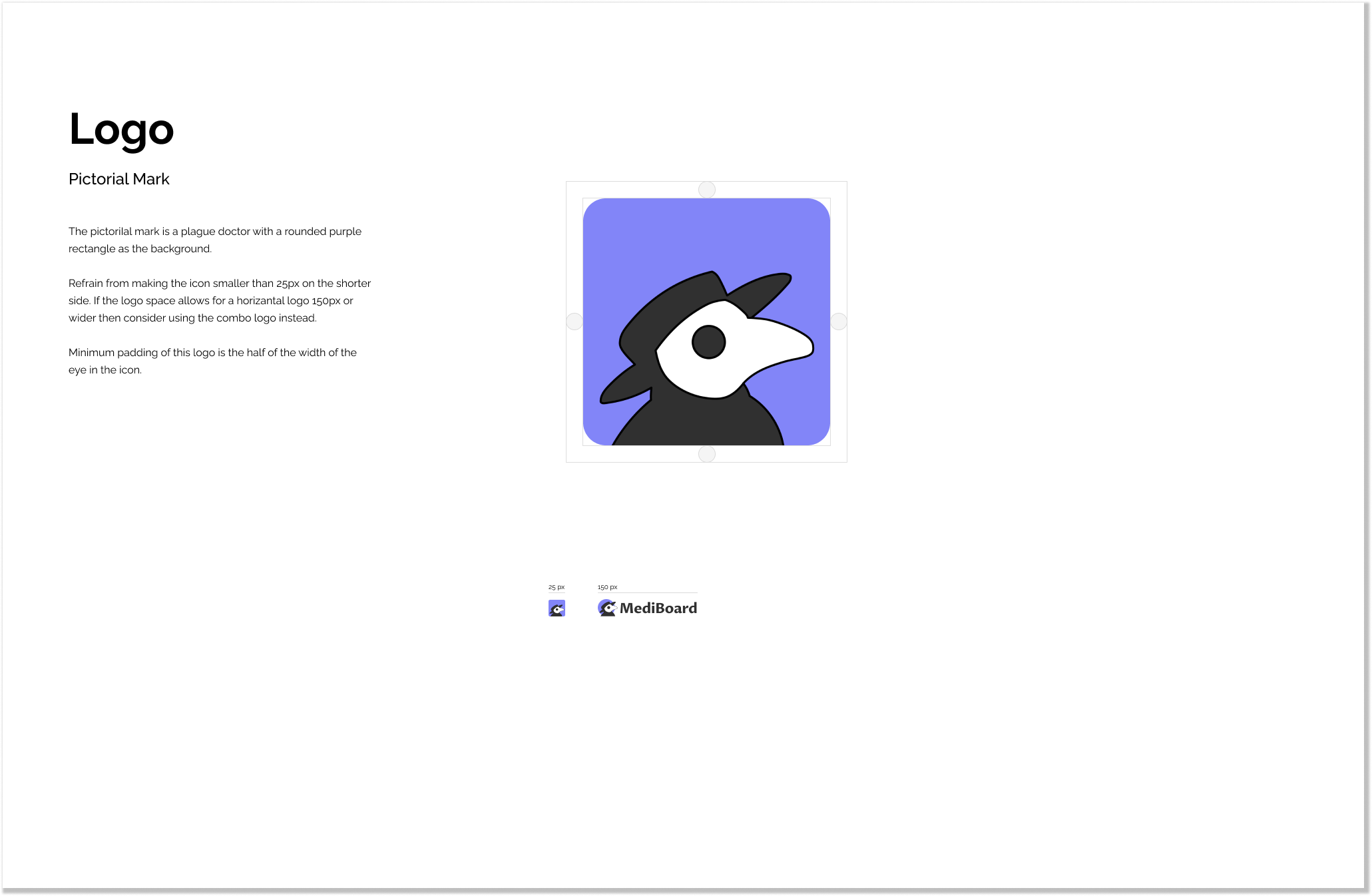
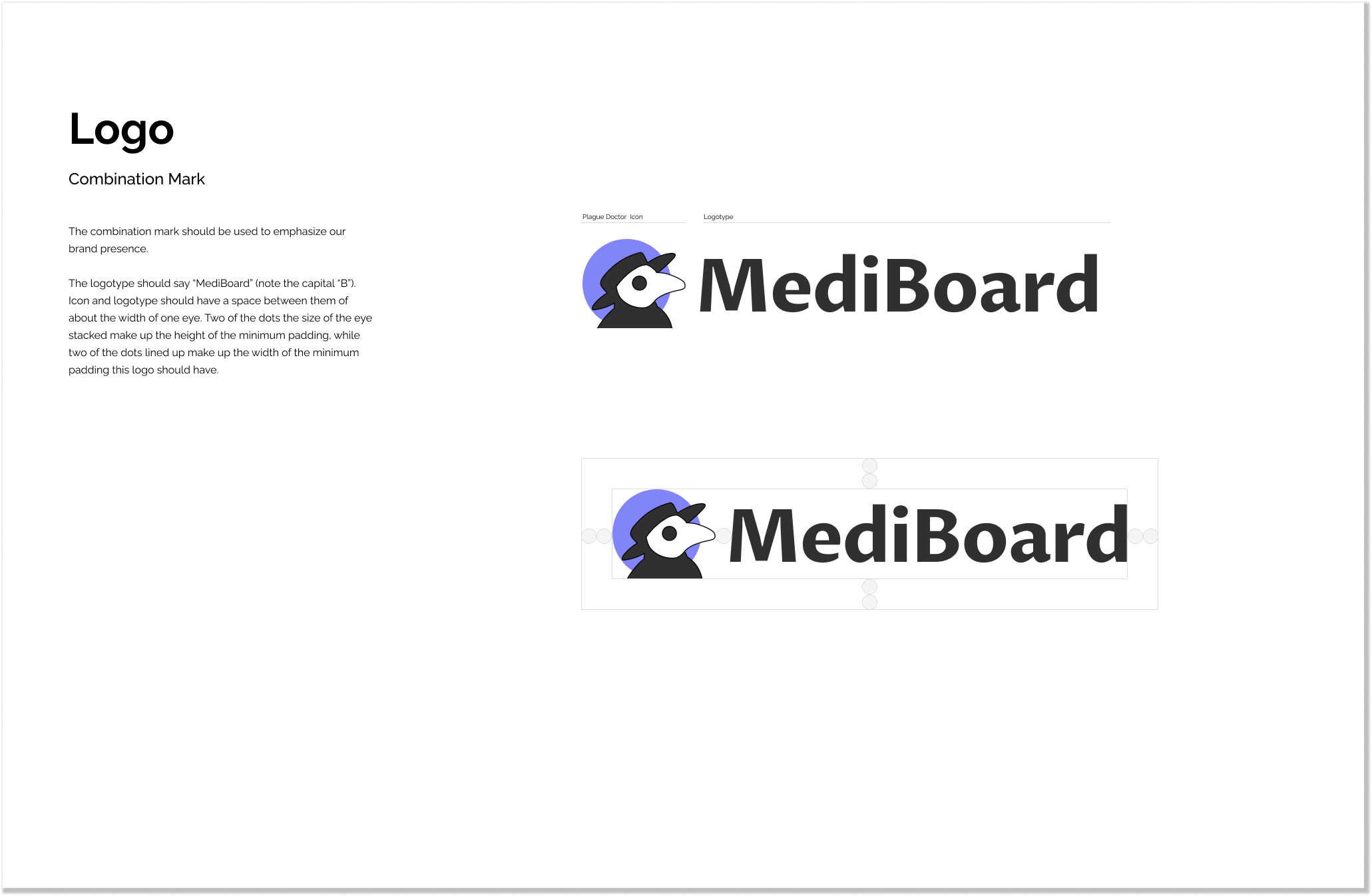
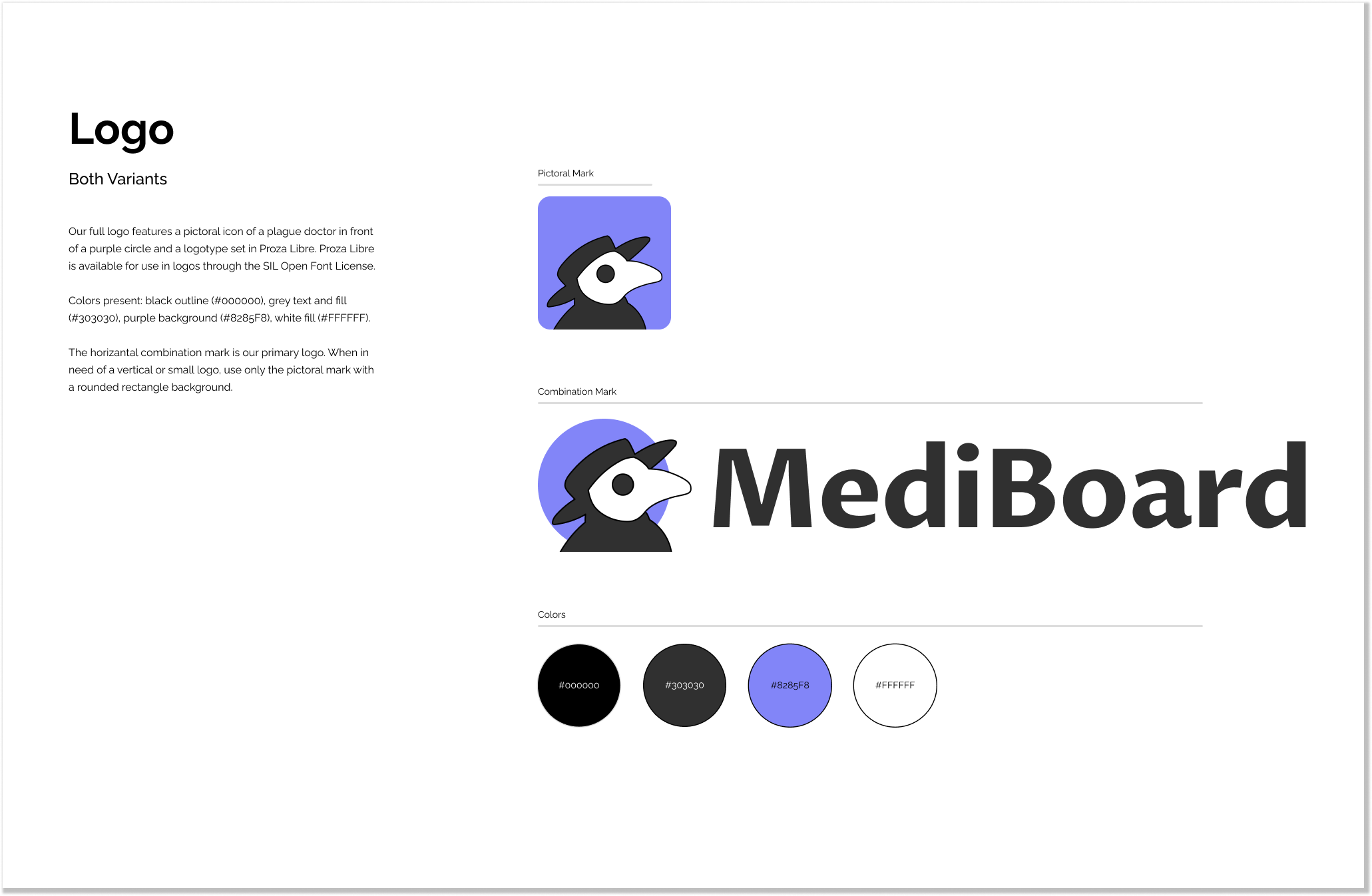
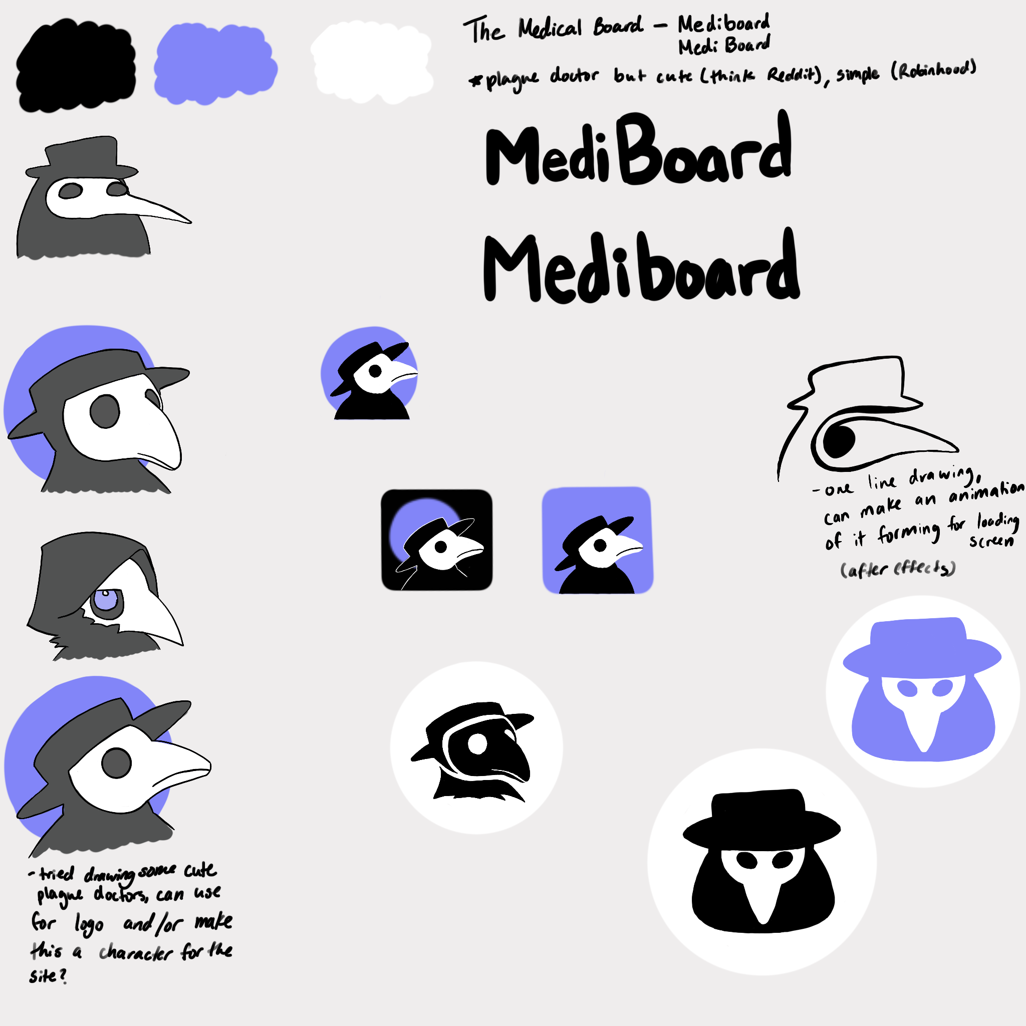
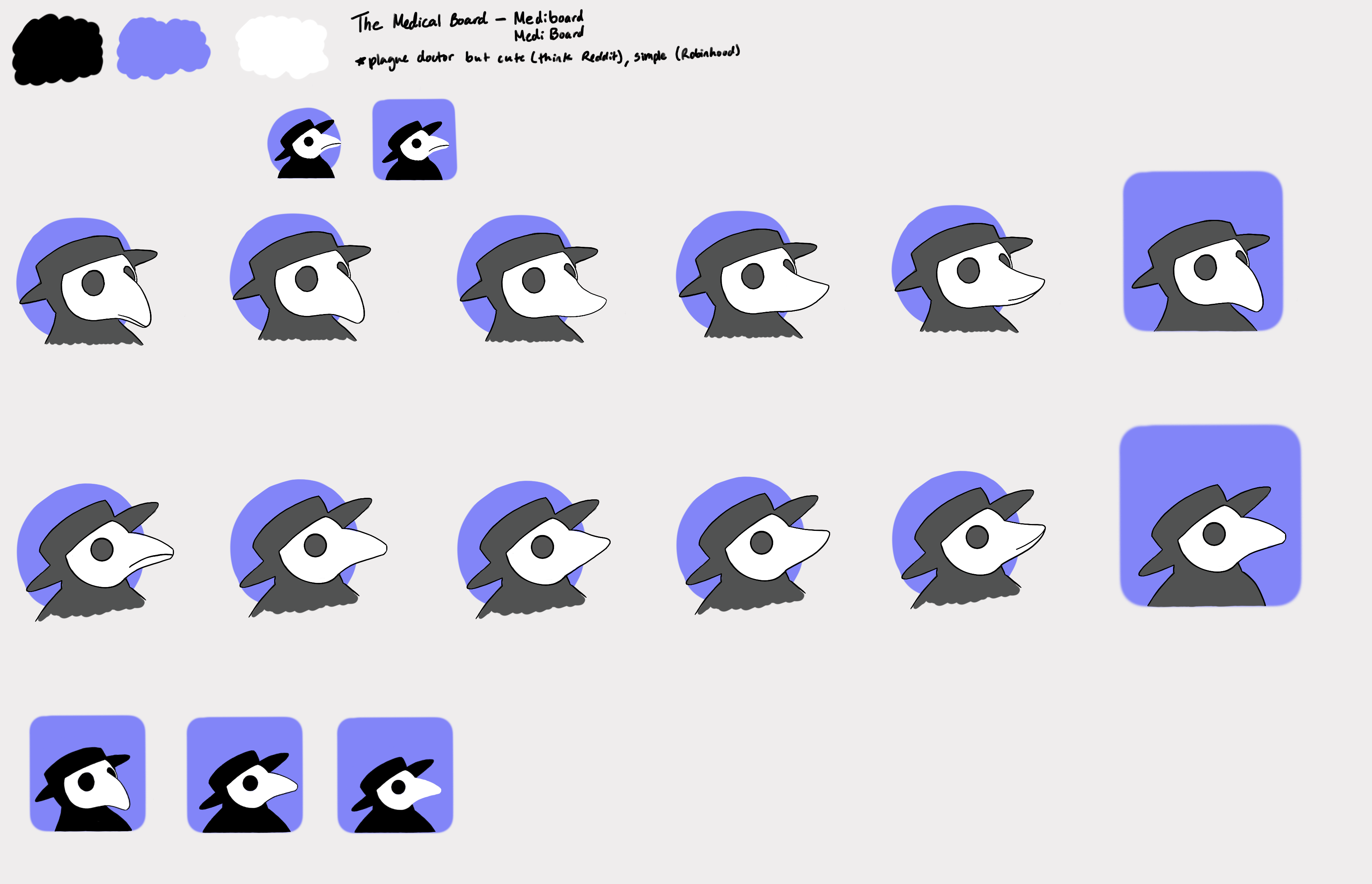
The Medical Board makes clinical trial data readable for patients. I designed the logo to feel approachable for a general audience while staying credible in a clinical space. The plague doctor mascot was an unexpected choice that ended up becoming widely recognized among their users.
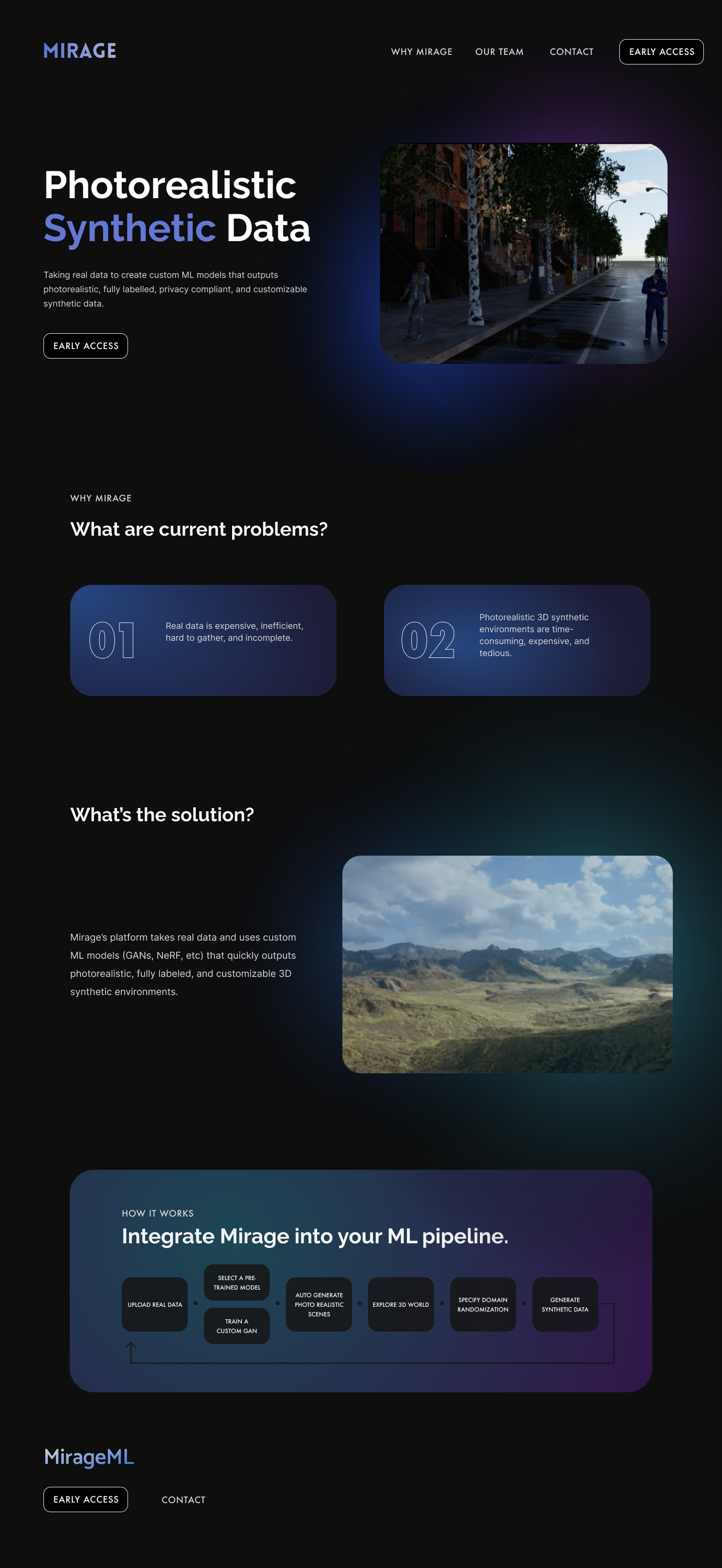
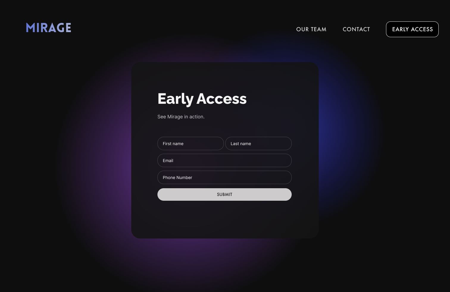
Mirage is an ML platform for generating photorealistic synthetic data. I designed and built the initial website on Figma and Webflow for their Sequoia fundraise.
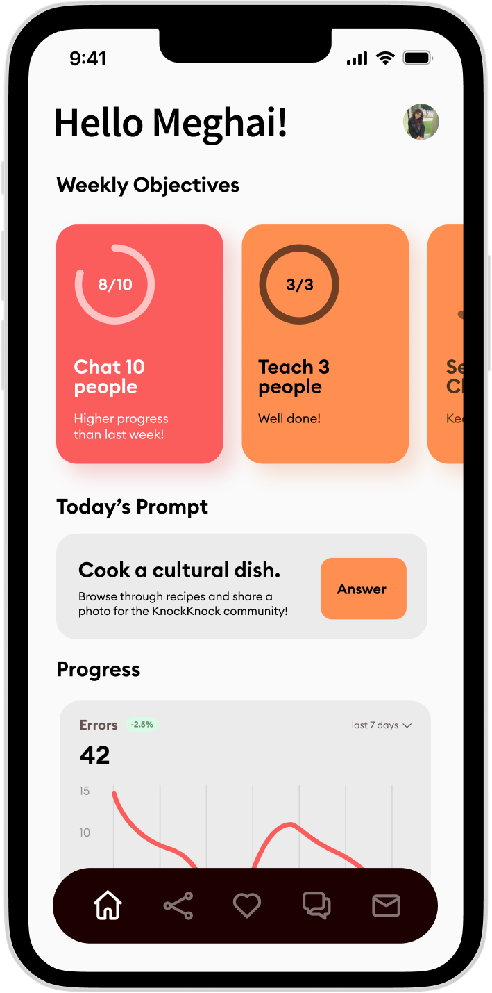
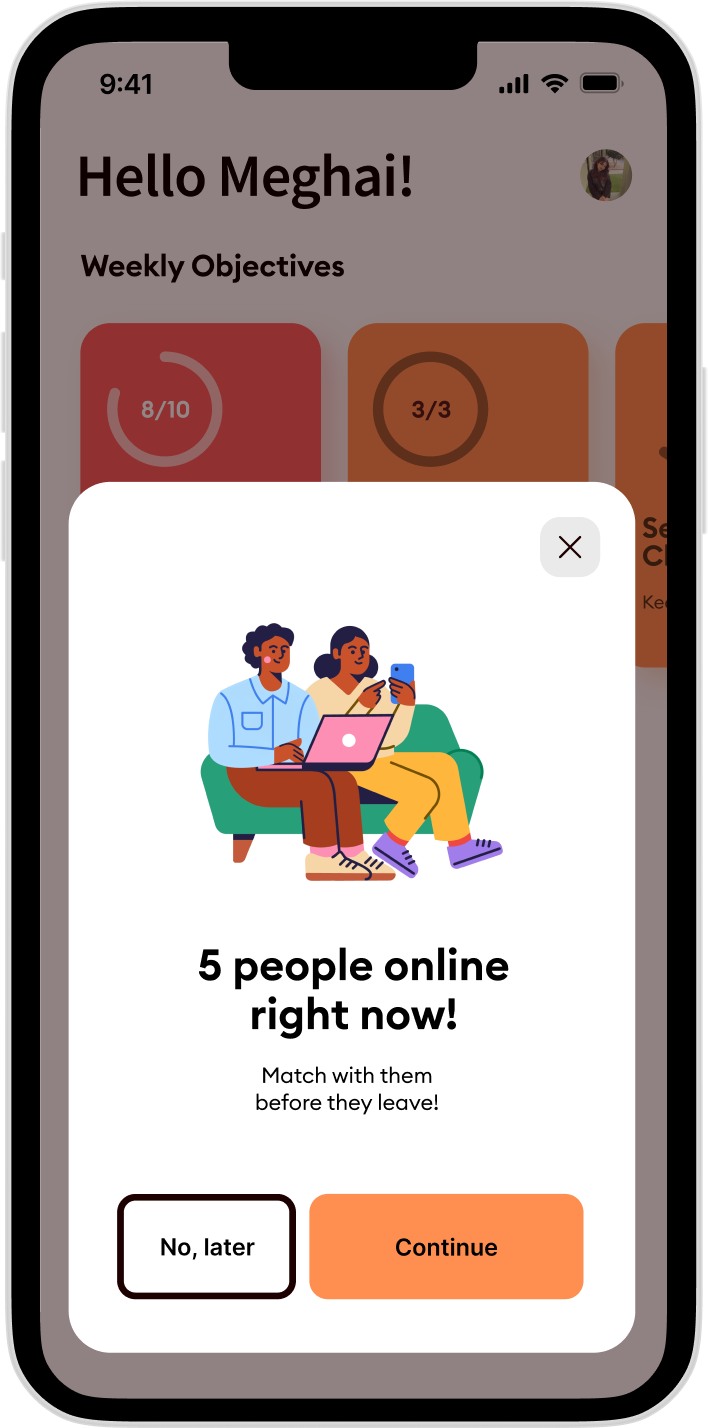
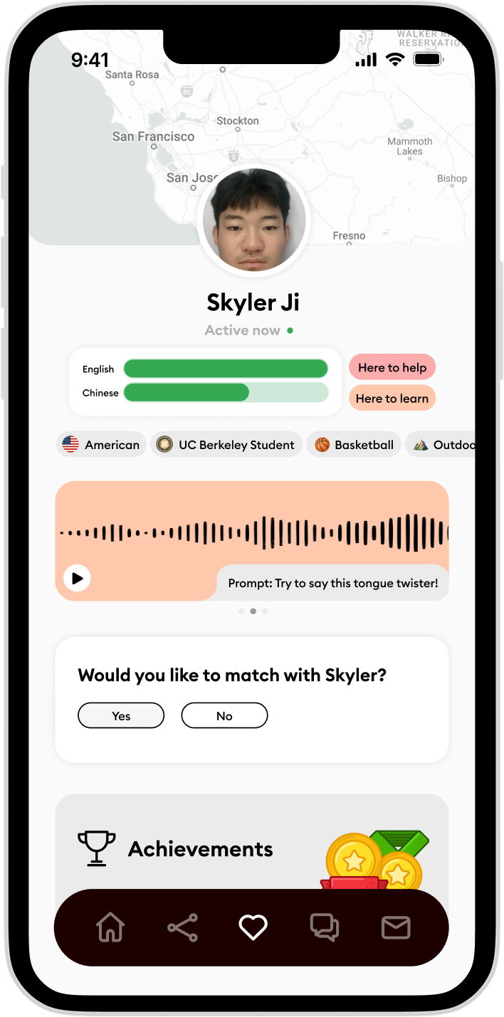
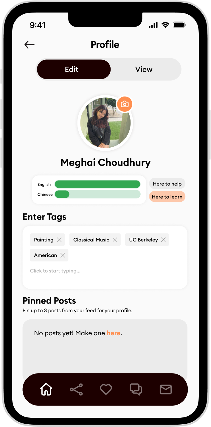
A language-exchange app connecting people through shared culture and conversation goals.
KnockKnock pairs users for language exchange based on shared interests, location, and learning goals. I came in after the team had done early user interviews and competitive research, and built the entire visual and interaction language from that foundation — including brand identity, home dashboard, matching flow, and profile screens.
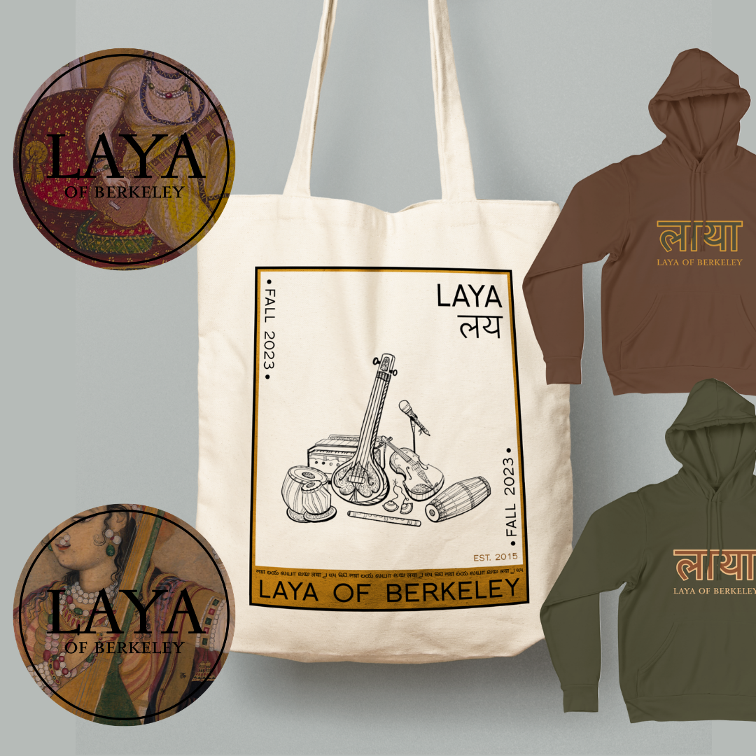
Sweatshirt, sticker, and tote bag designs for a South Asian music group at UC Berkeley: a mix of graphic design and original illustration drawing on traditional desi art.
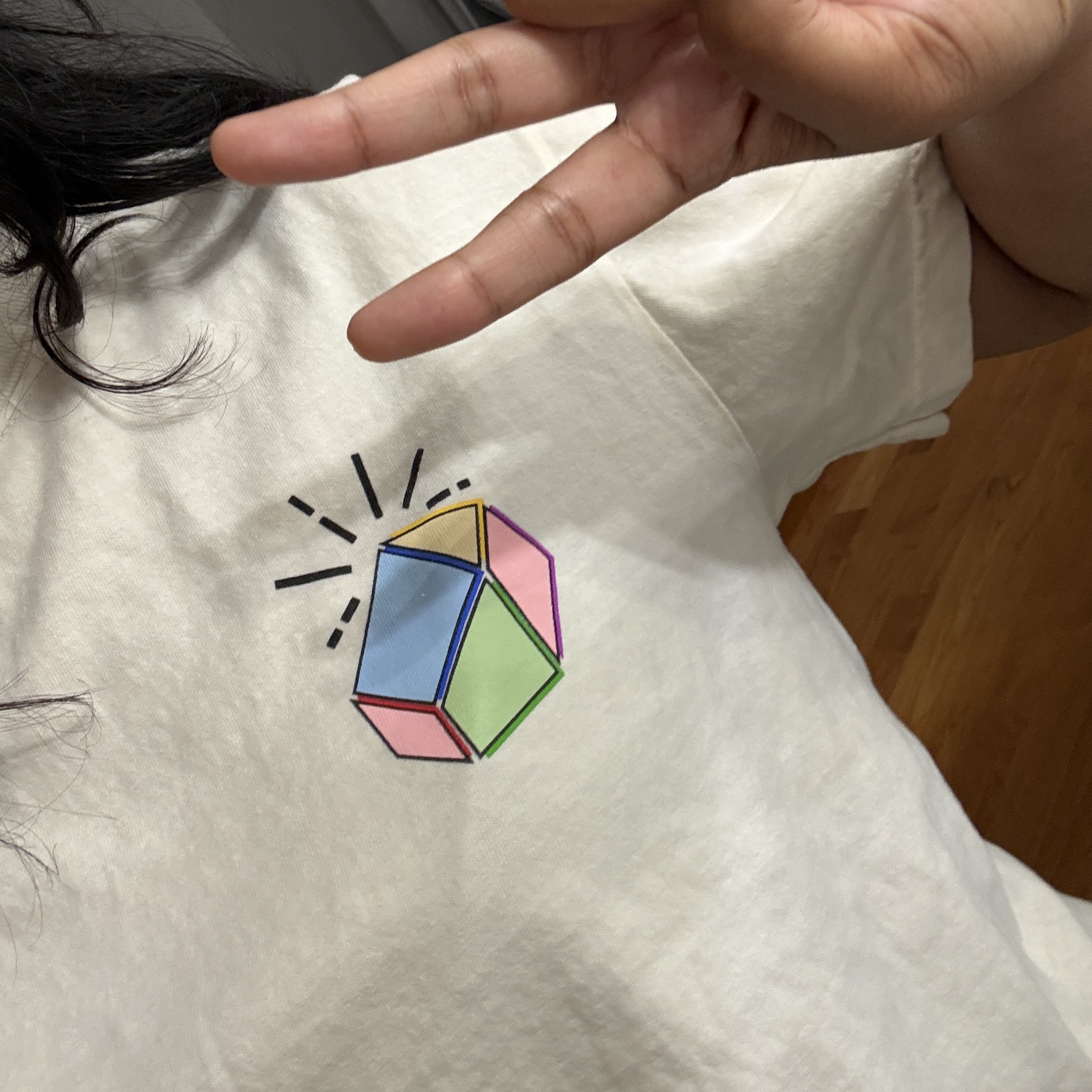
Merch for an edtech startup: a stylized Flint logo built from bright, primary-colored geometry blocks that make learning feel like fun.
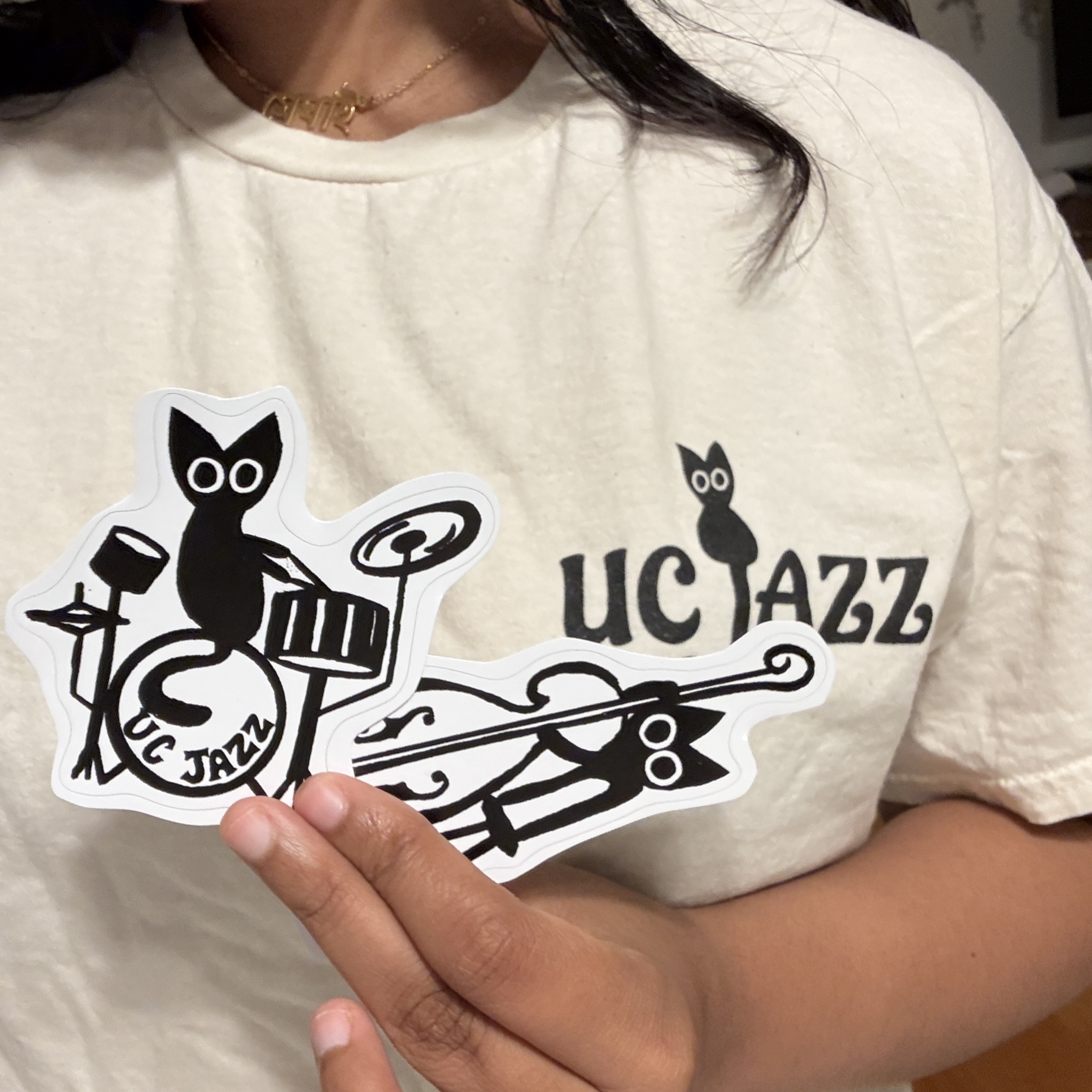
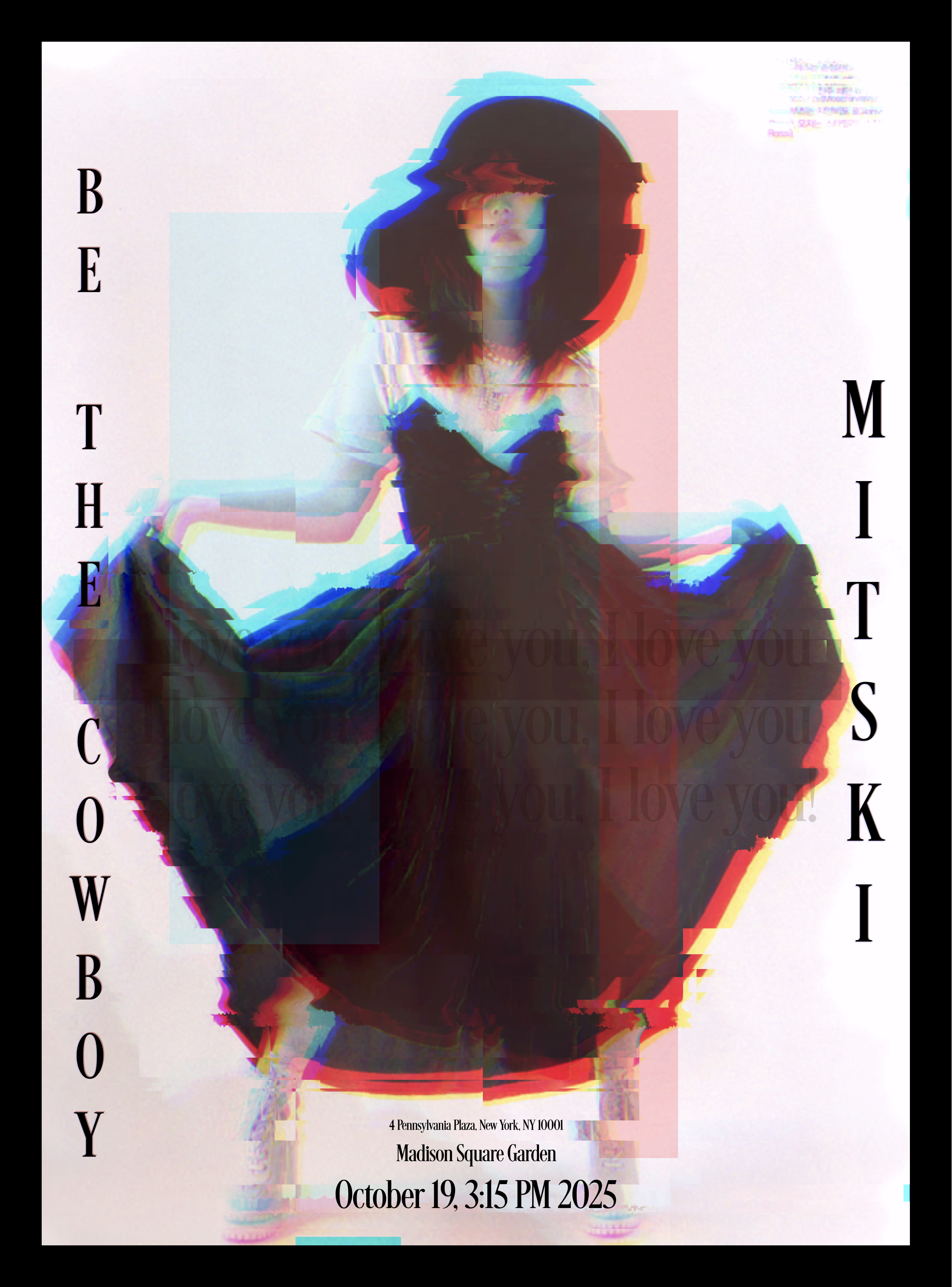
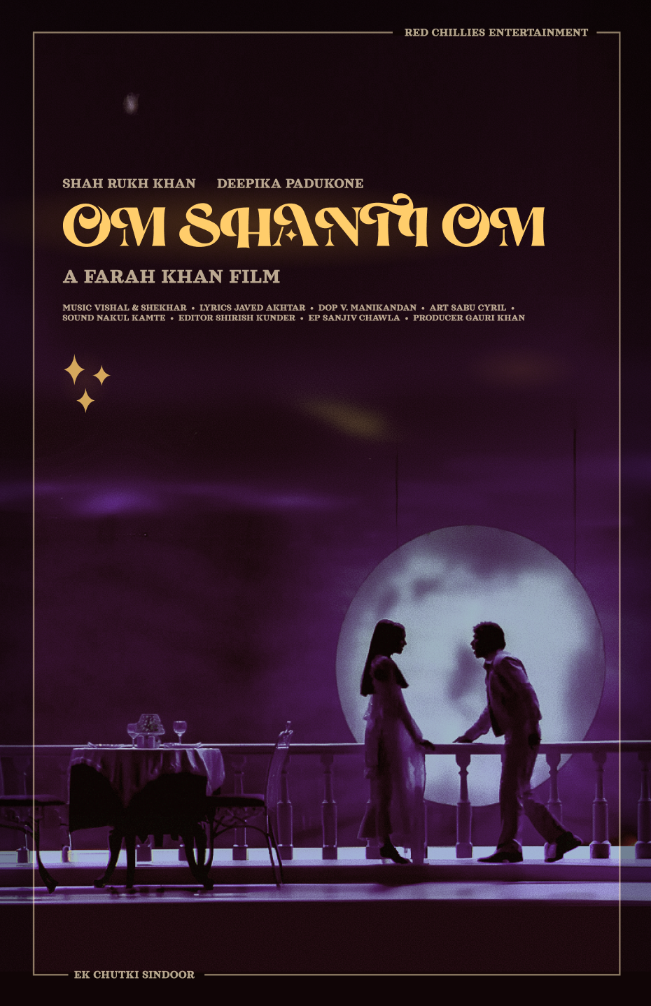
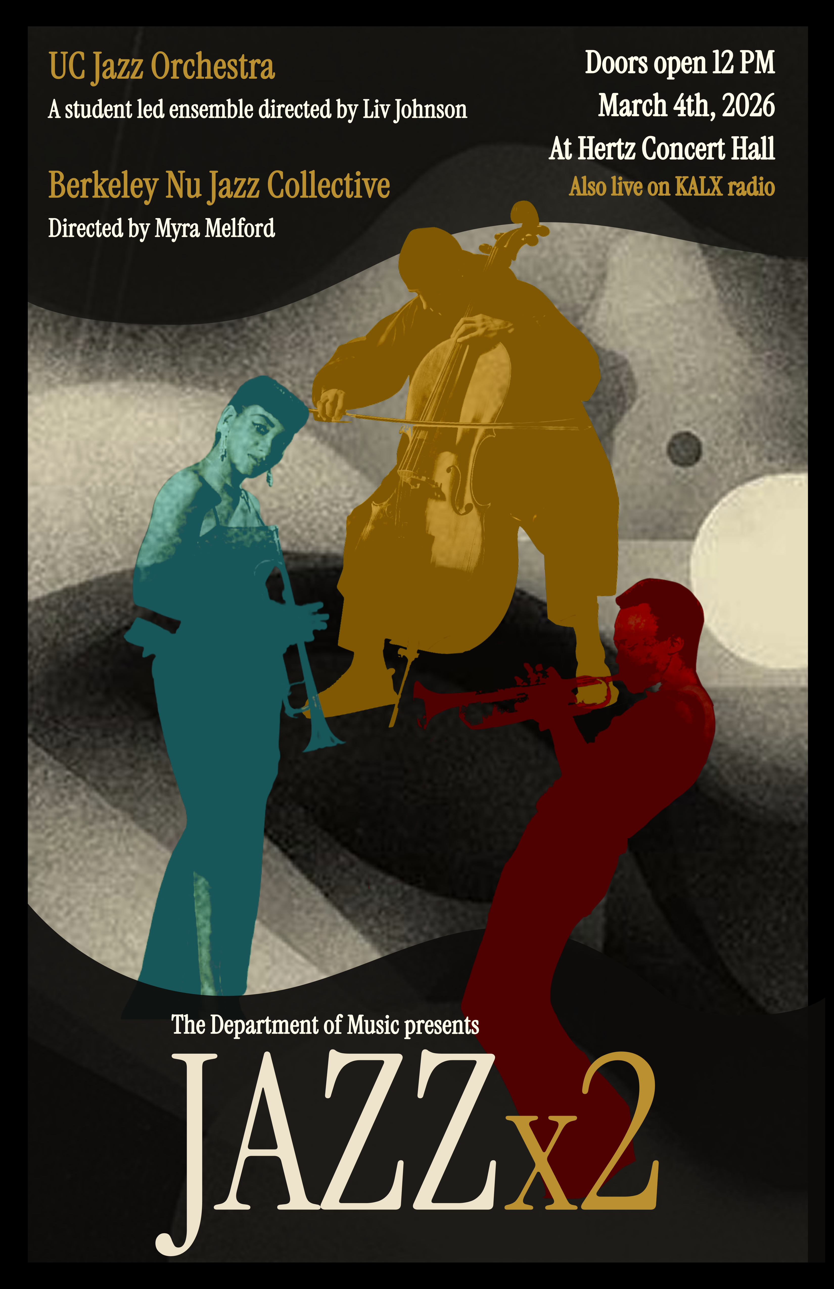
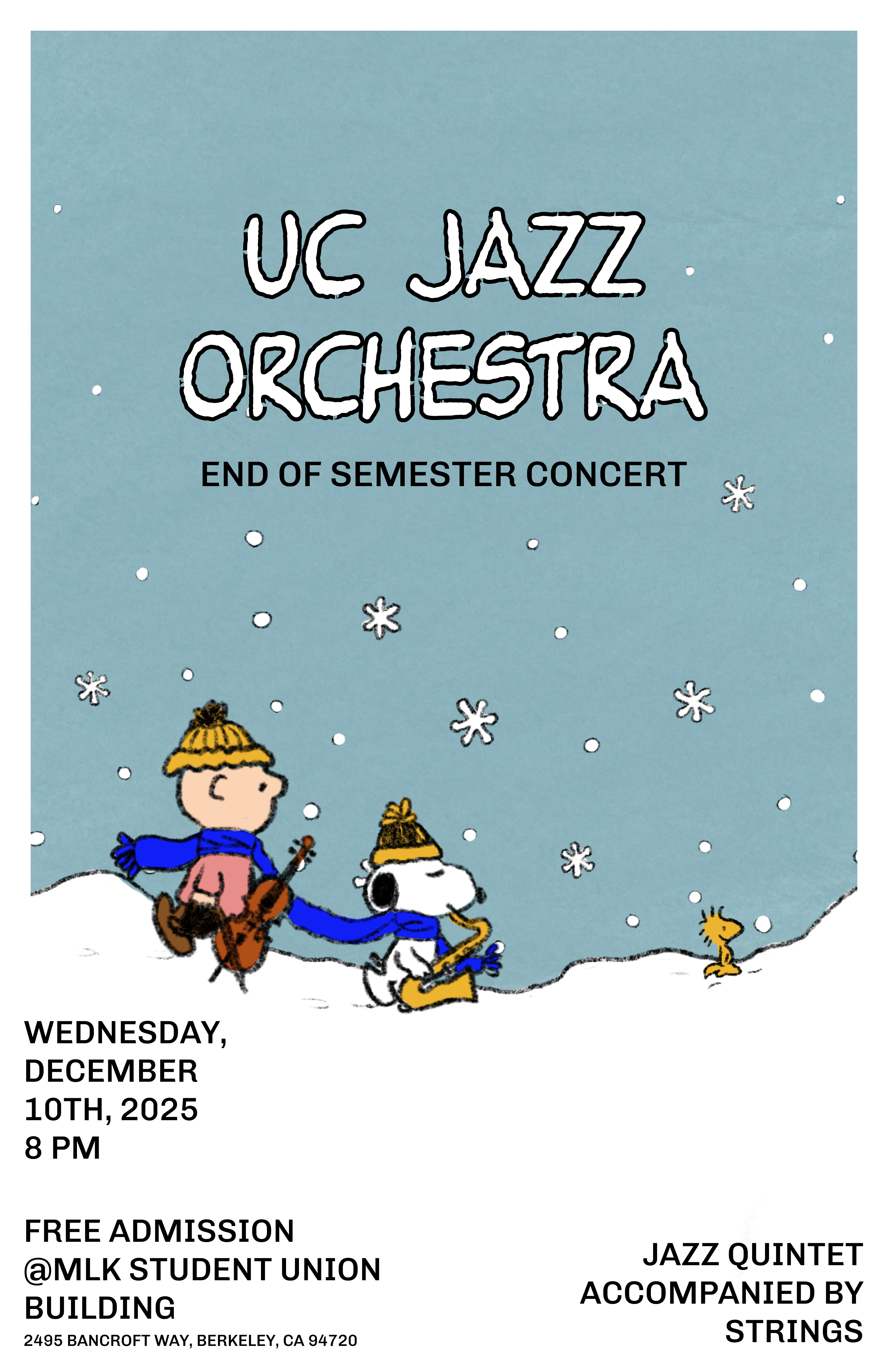
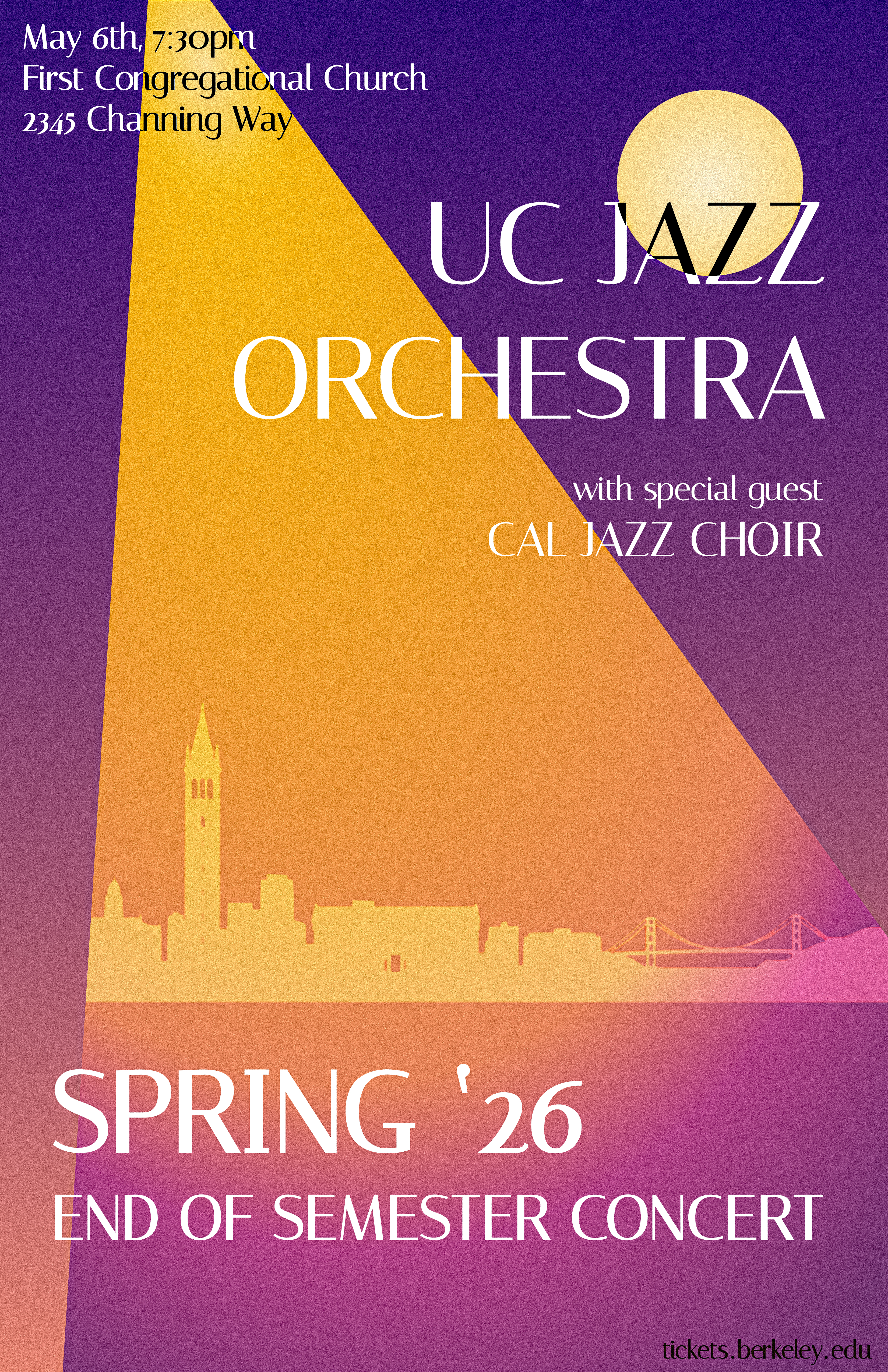
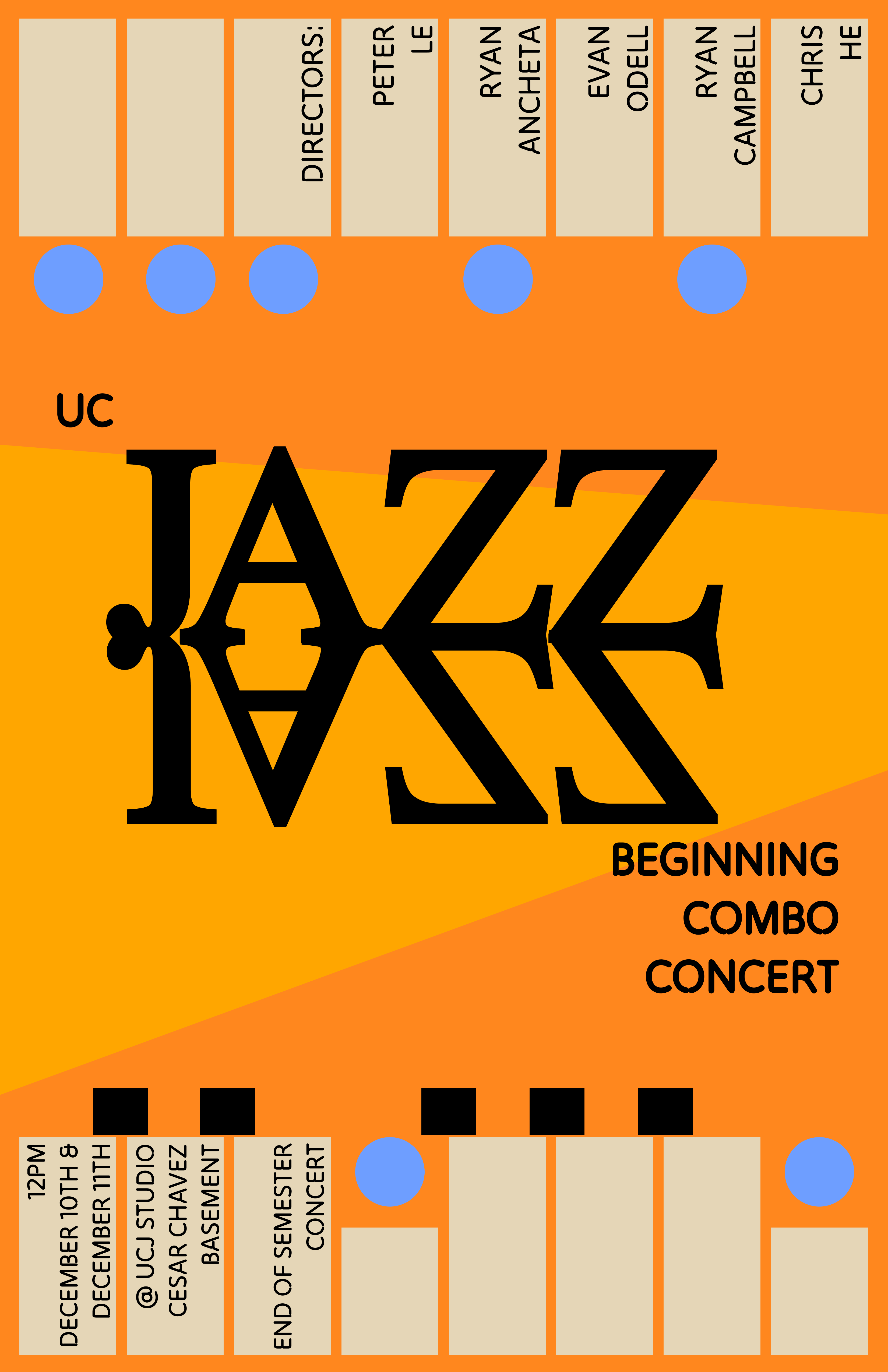
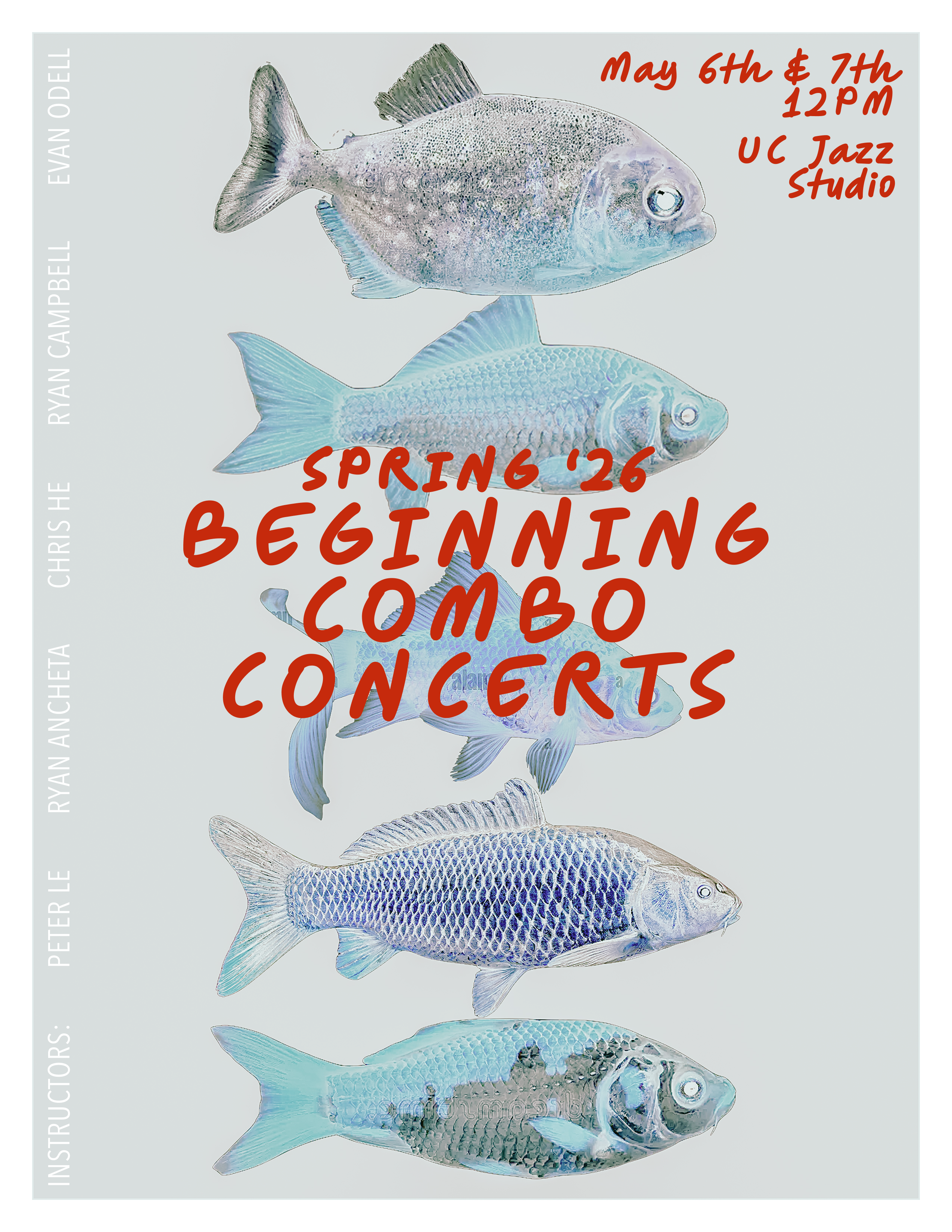
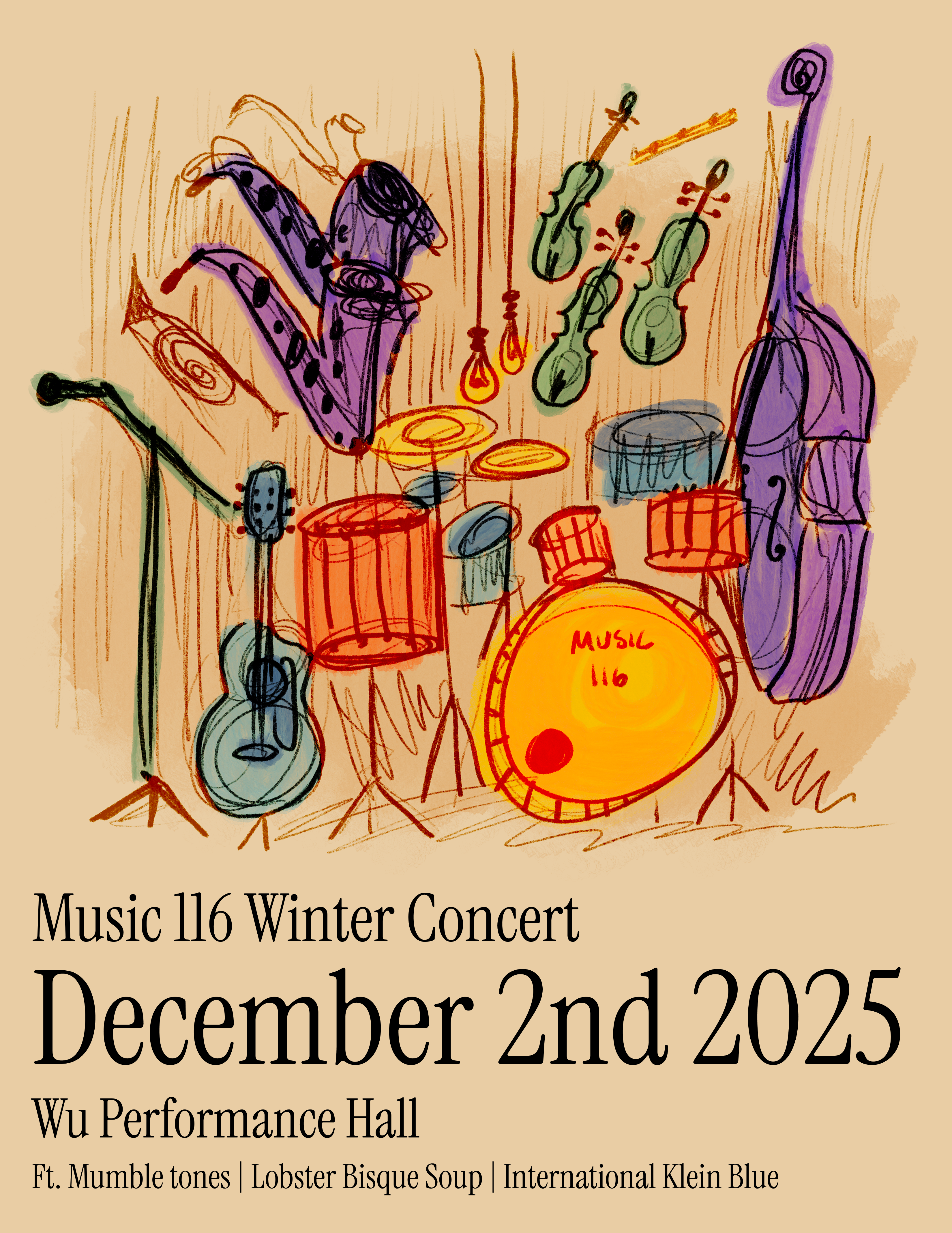
T-shirt and sticker designs for UC Berkeley's jazz organization, illustrated around the jazz slang "cat," the word musicians use for someone who really plays.
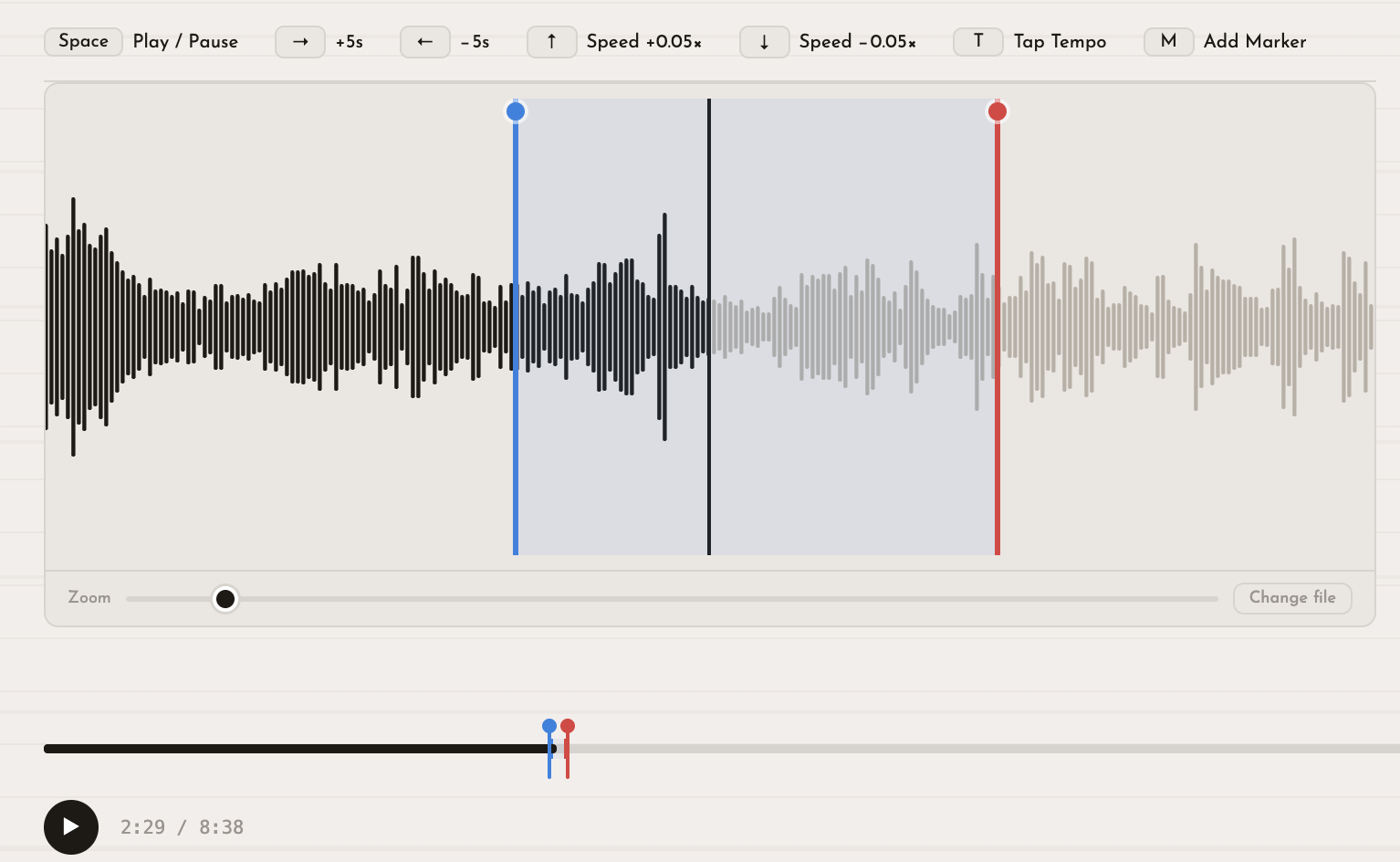
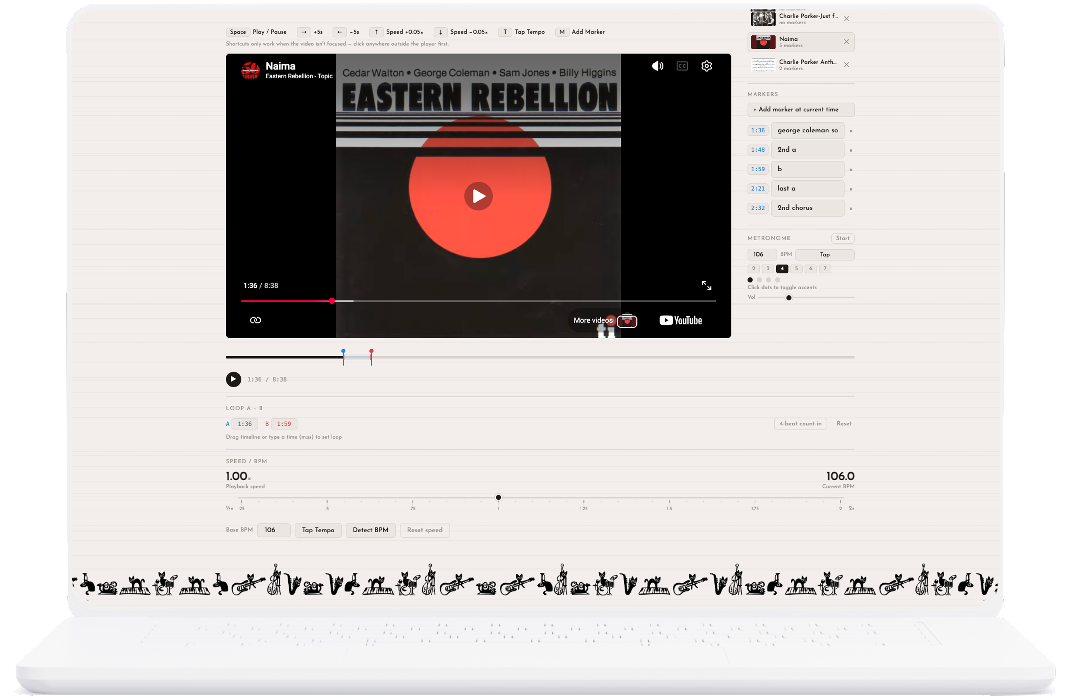
A transcription is learning a recorded solo by ear, note by note. One of the foundational ways jazz musicians learn is by copying the way the greats played. The process requires slowing audio down, looping short phrases, and marking moments to return to.
Most musicians have their own cobbled-together process: YouTube and a separate metronome, Chrome extensions, an MP3 download into whatever playback software they have. But across all methods, the workflow is fragmented and constantly pulls you out of the music.
I built this because my own process was fragmented — and I realized that only part of my slowness was my ear. The rest was the clumsy process itself.
ResearchI observed three jazz musicians transcribing in their natural workflow before designing anything.
I then ran think-aloud sessions with five musicians on an early version of the tool, and sent them iterations as I built.
Design DecisionsWaveform over video: Watching a musician pull up an audio engineer tool was the clearest signal — musicians need to see the audio, not the video. I added an MP3 upload tab with a full waveform view for precise loop-point setting. For YouTube uploads, I kept the large video player because musicians are so used to that interface that removing it would feel foreign.
Speed-relative seeking: At 0.5× speed, skipping 5 seconds forward feels like 10 real seconds of music, which felt too far. I made skip distance proportional to playback speed, so at half speed you move half as far.
Built-in metronome with BPM sync: Once I saw the app-switching happening, the fix was obvious. Tap or detect the tempo, and the metronome syncs to it. When you slow the playback down, the metronome slows with it. You can practice a phrase at full speed, drop it to half, and practice again without ever reentering the tempo.
Keyboard shortcuts: Think-aloud sessions made clear I needed more than YouTube's defaults. I added up/down arrows for speed and a key to drop a marker mid-phrase without breaking flow.
A-to-B looping: Set two points in the audio and loop between them indefinitely while you work out a phrase.
The ResultA single-page tool that consolidates the full transcription workflow:
All without ever leaving the browser.
An unexpected use case emerged after launch: composition arrangers using the tool, working through a recording phrase by phrase to transcribe a piece before arranging it for a new ensemble!
Try it out yourself